← Back to sections
See all comparison sections
Comparison
from diploria.ai · closes the page
How common each one is
- Price anchor0 of the 43 saas comparison sections we have measured (0%)
- Rating1 of the 43 saas comparison sections we have measured (2%)
- Guarantee0 of the 56 saas comparison sections we have measured (0%)
- No-credit-card note1 of the 30 saas comparison sections we have measured (3%)
- Scarcity0 of the 64 saas comparison sections we have measured (0%)
- Countdown0 of the 64 saas comparison sections we have measured (0%)
In the population this comparison was measured in. A count, not a recommendation.
What this comparison contains
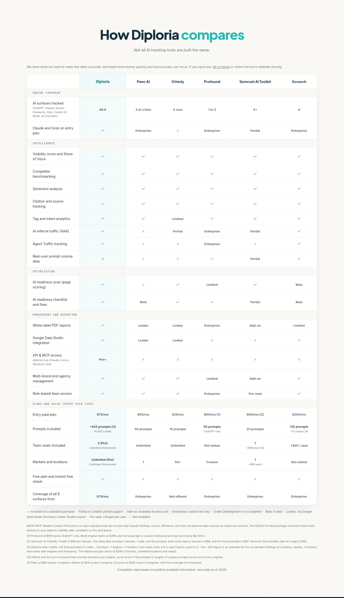
- Heading“How Diploria compares” (h2)
- Text573 words · 3,467 characters
- Button text“let us know” (up to 3 distinct labels, of 1 links and buttons counted here)
- Links out1
- Images and icons53
- Tablepresent
Read out of the DOM at crawl time. Quoted text is the page's own, typos included.
How it compares
- HeightTaller than 91% of them — 149 of the 164 comparison sections we have measured.
- Where it startsStarts further down its page than 74% of them — 121 of 164.
Measured against every band of this type in the corpus. A position, not a grade.
The page it sits on
nav→hero→content→faq→comparison→content→footer
Every band measured on this capture, in order — 7 in all, this one highlighted. A band we have not published a page for is not a link.
Appears on 190 of the 2703 pages we've measured.