Section Design Library · Comparison
Comparison sections from real pages
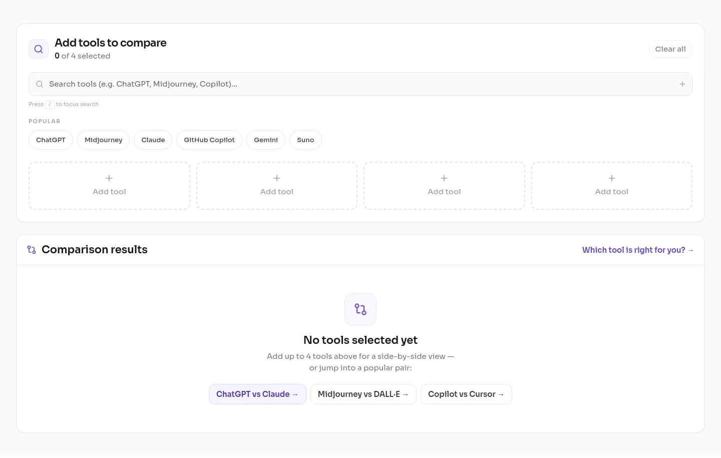
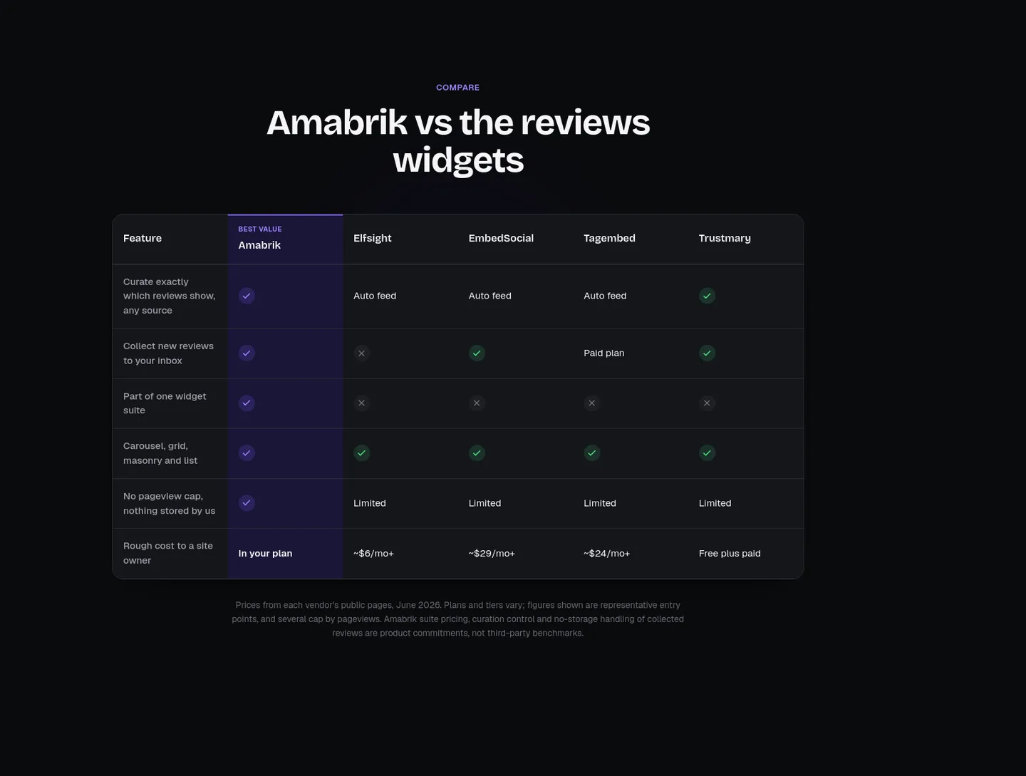
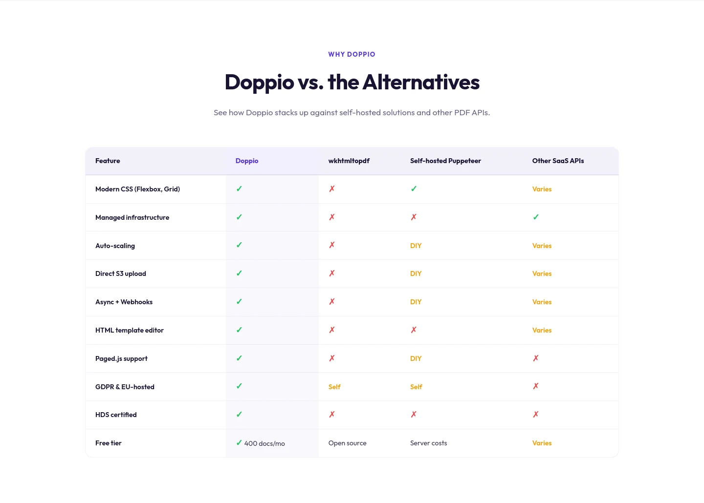
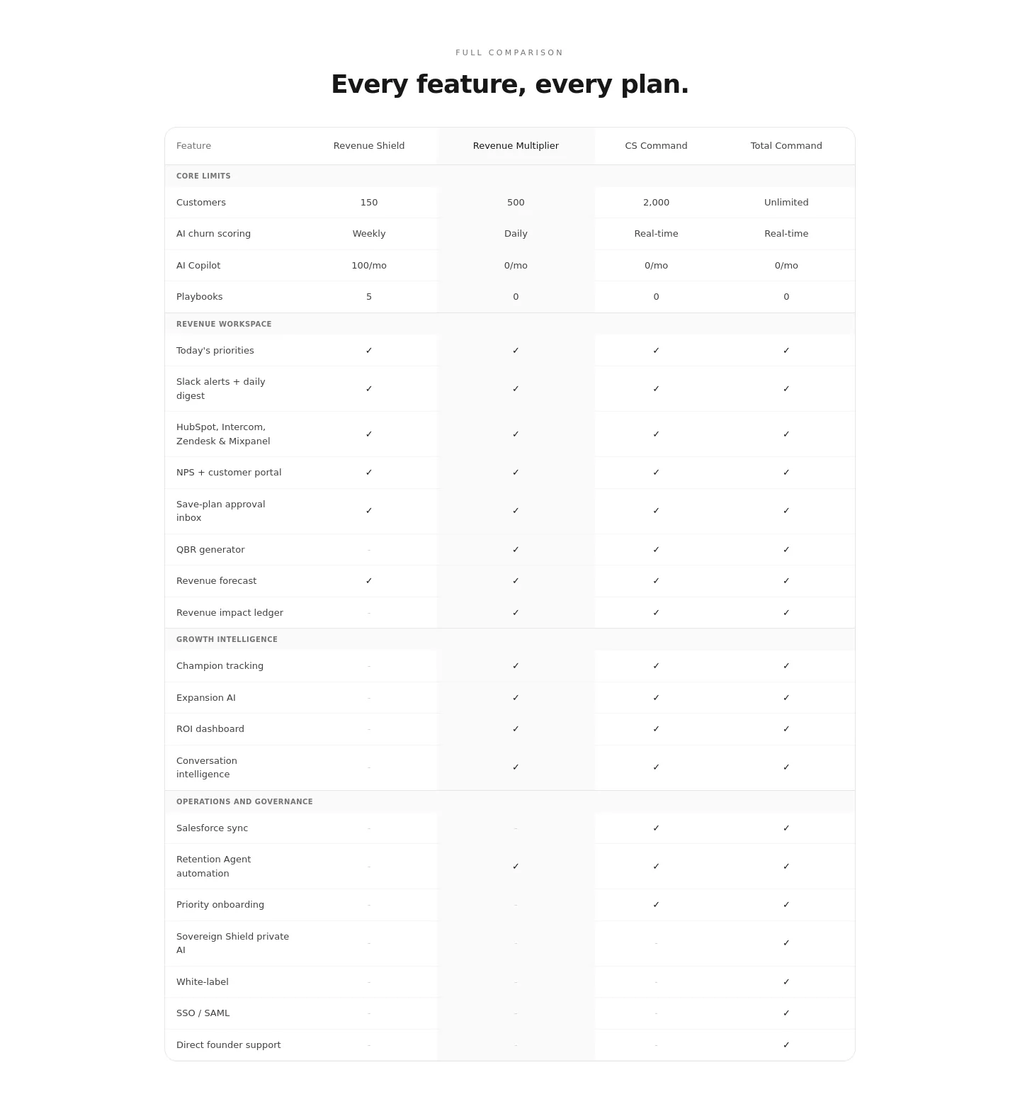
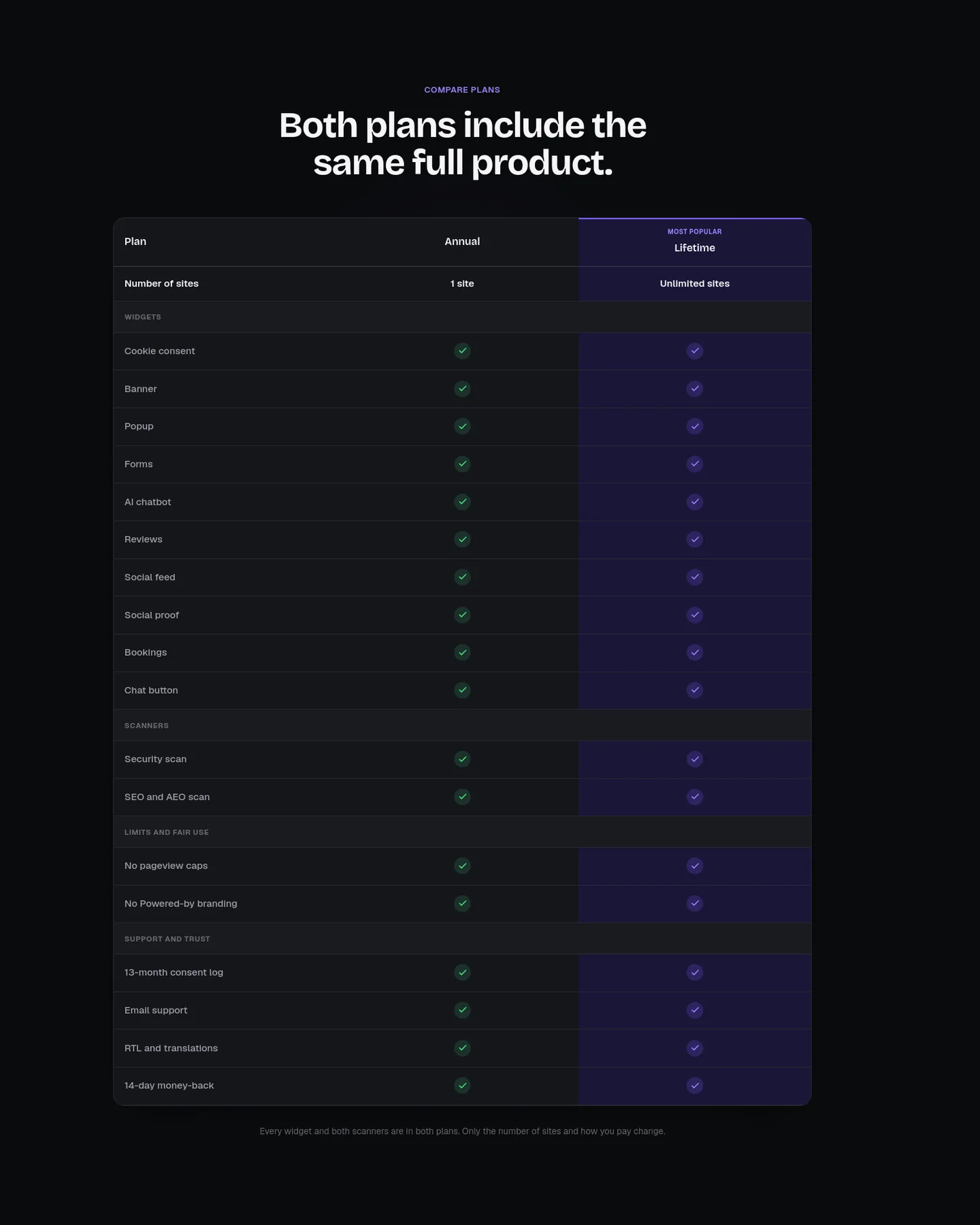
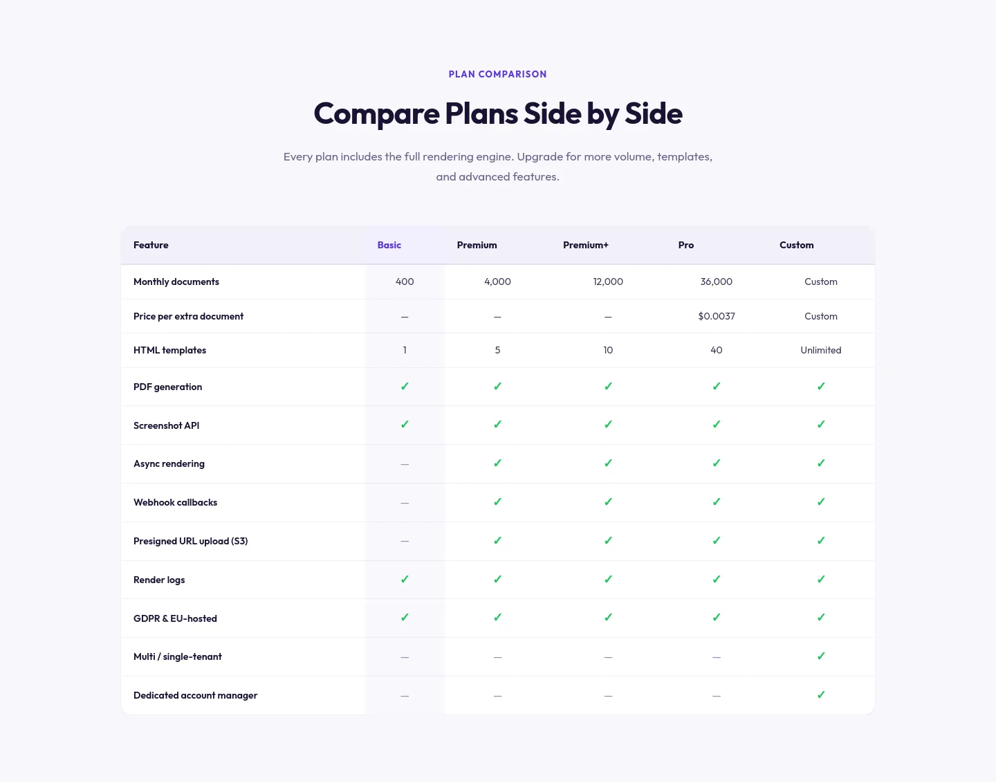
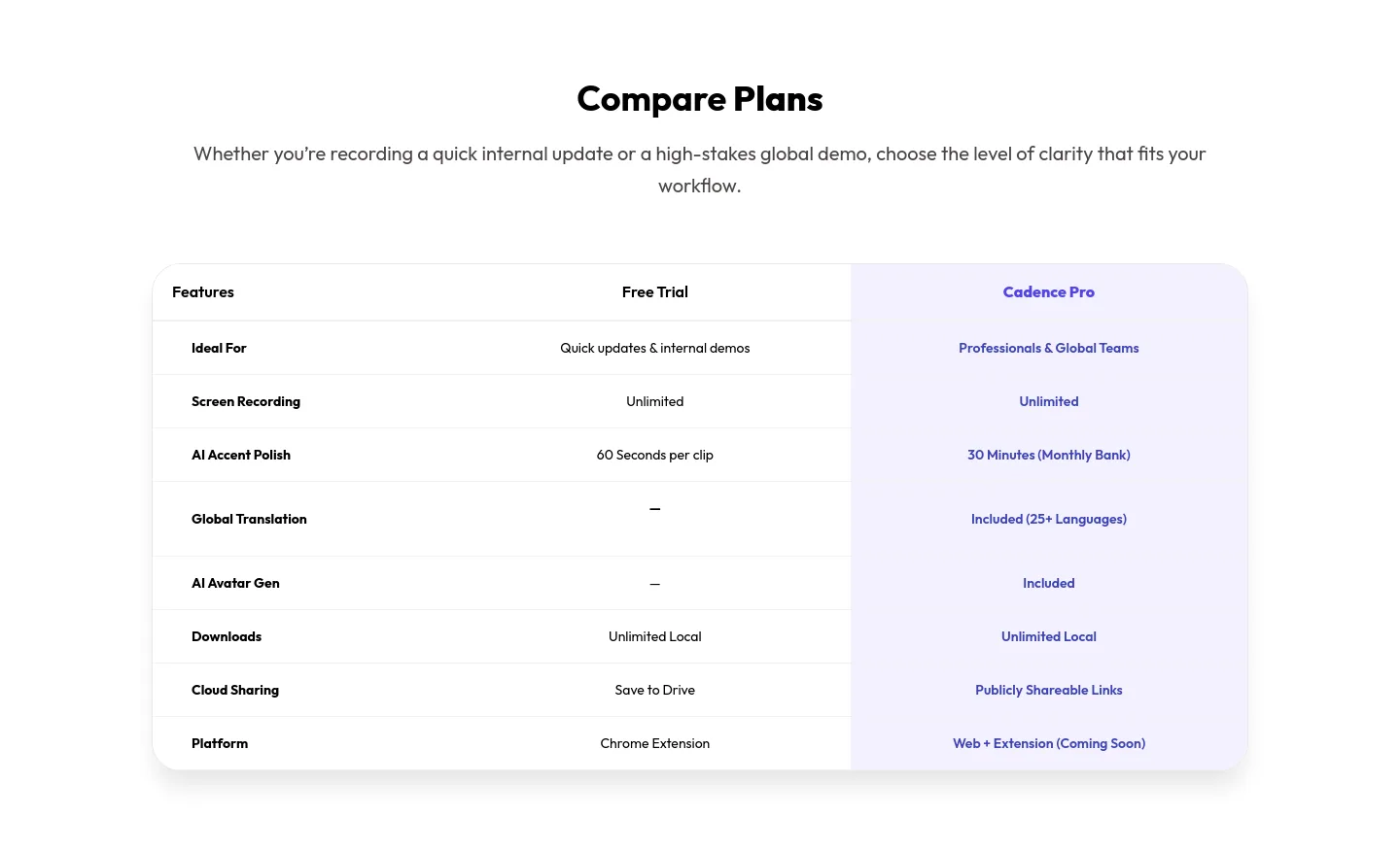
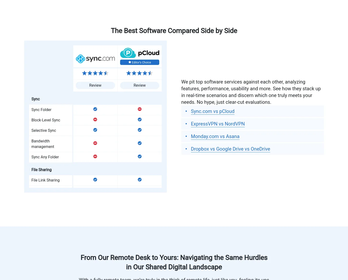
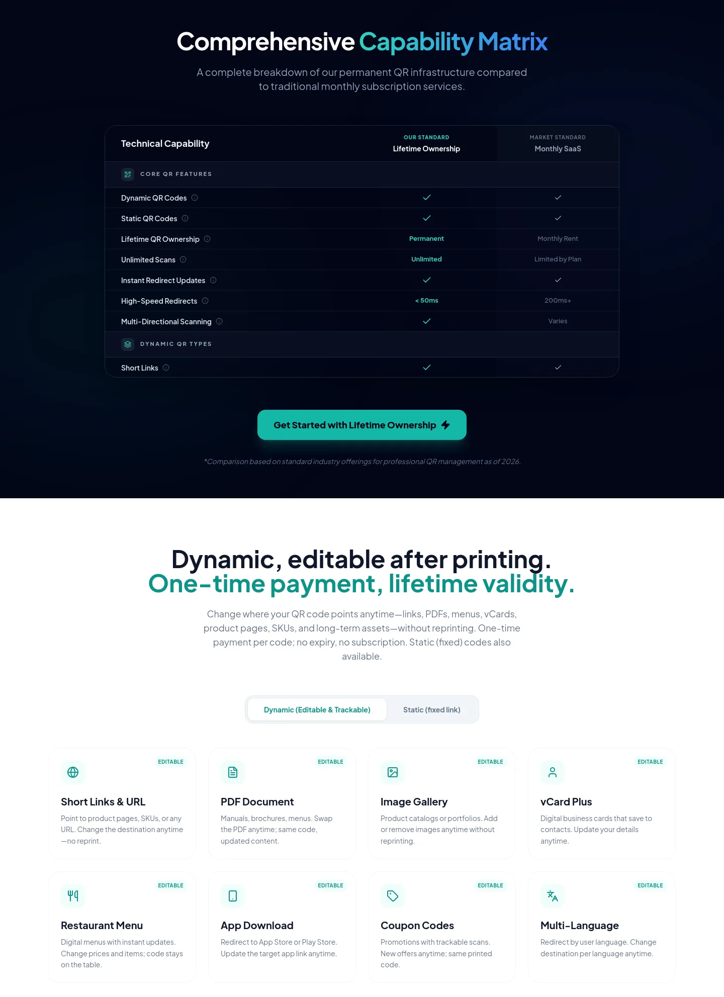
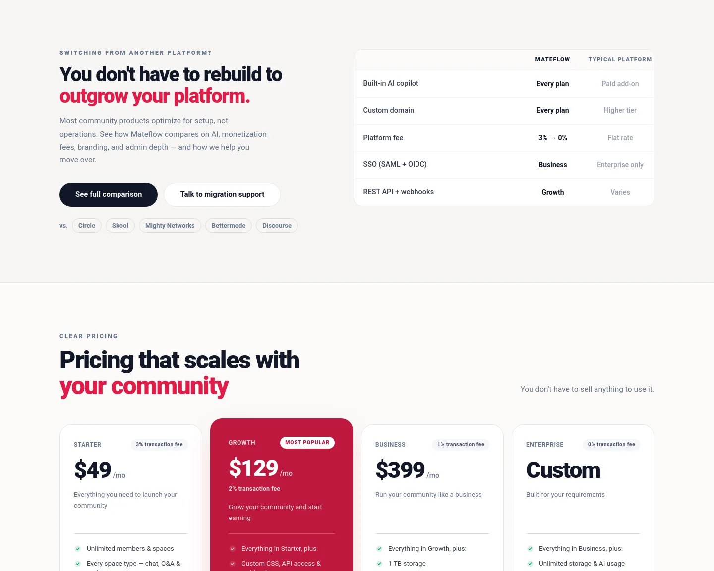
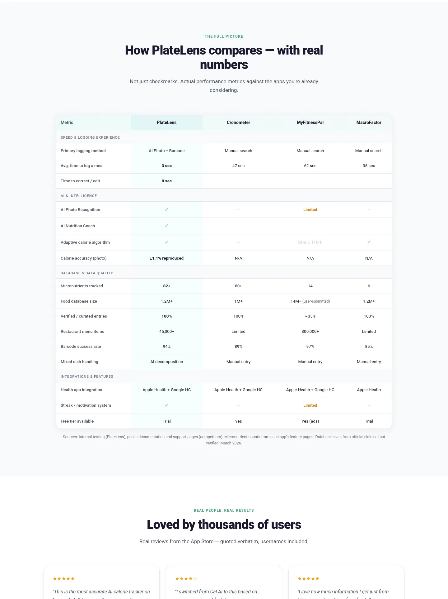
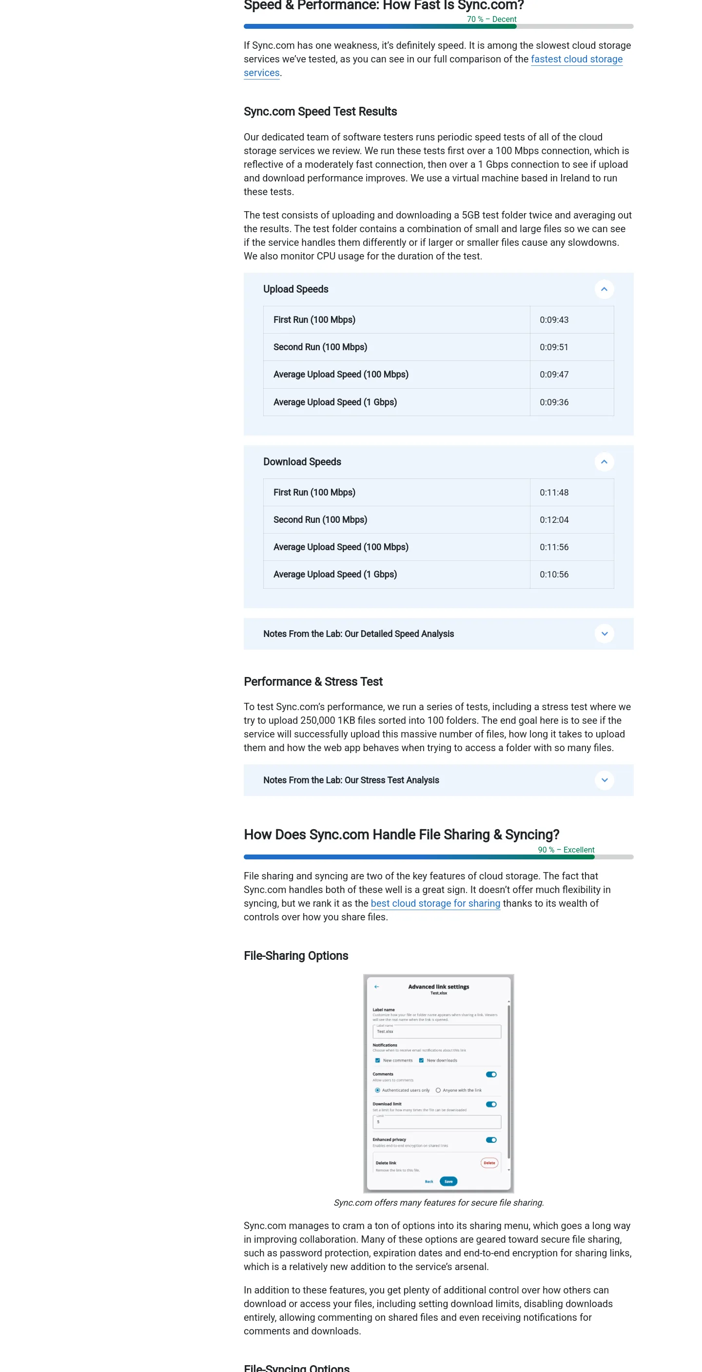
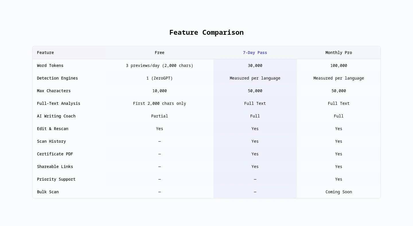
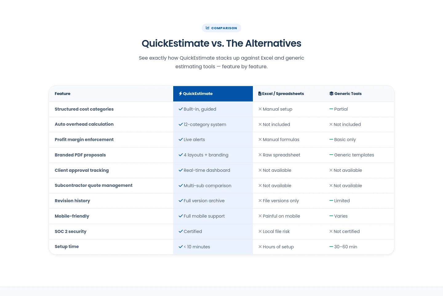
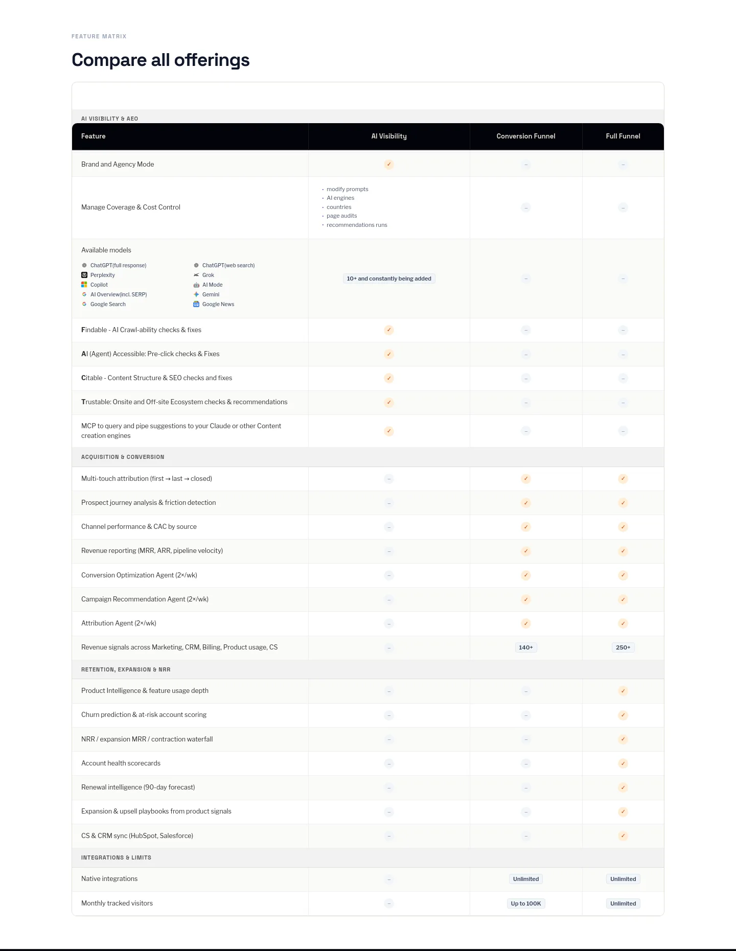
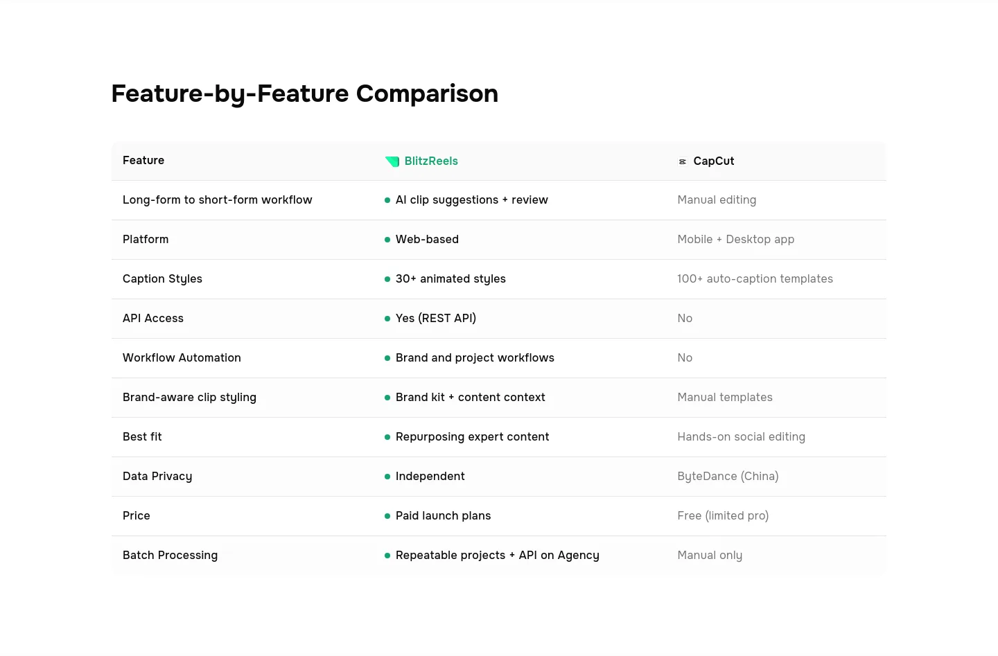
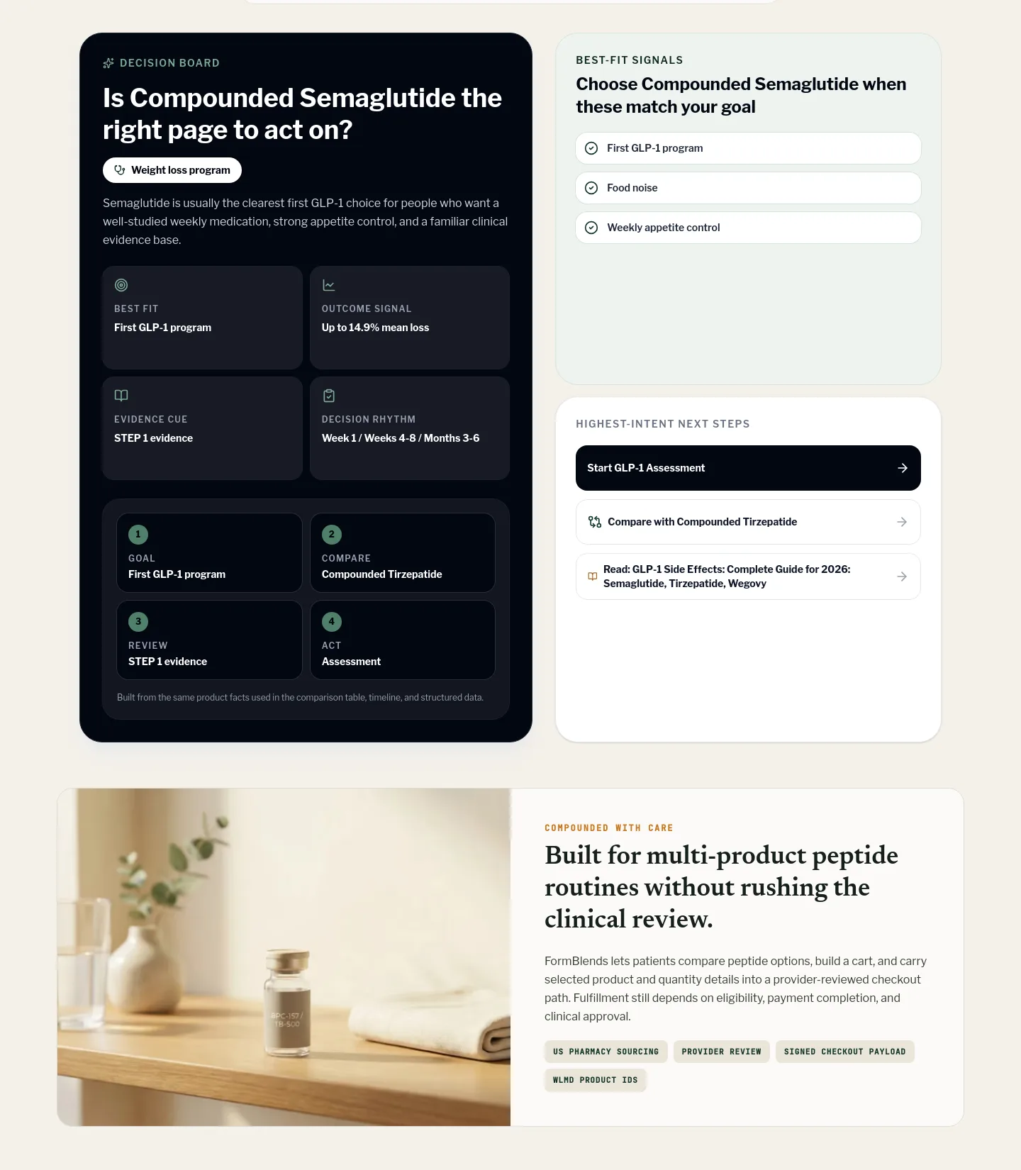
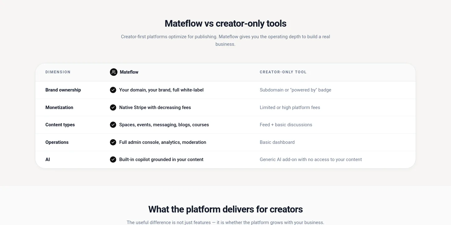
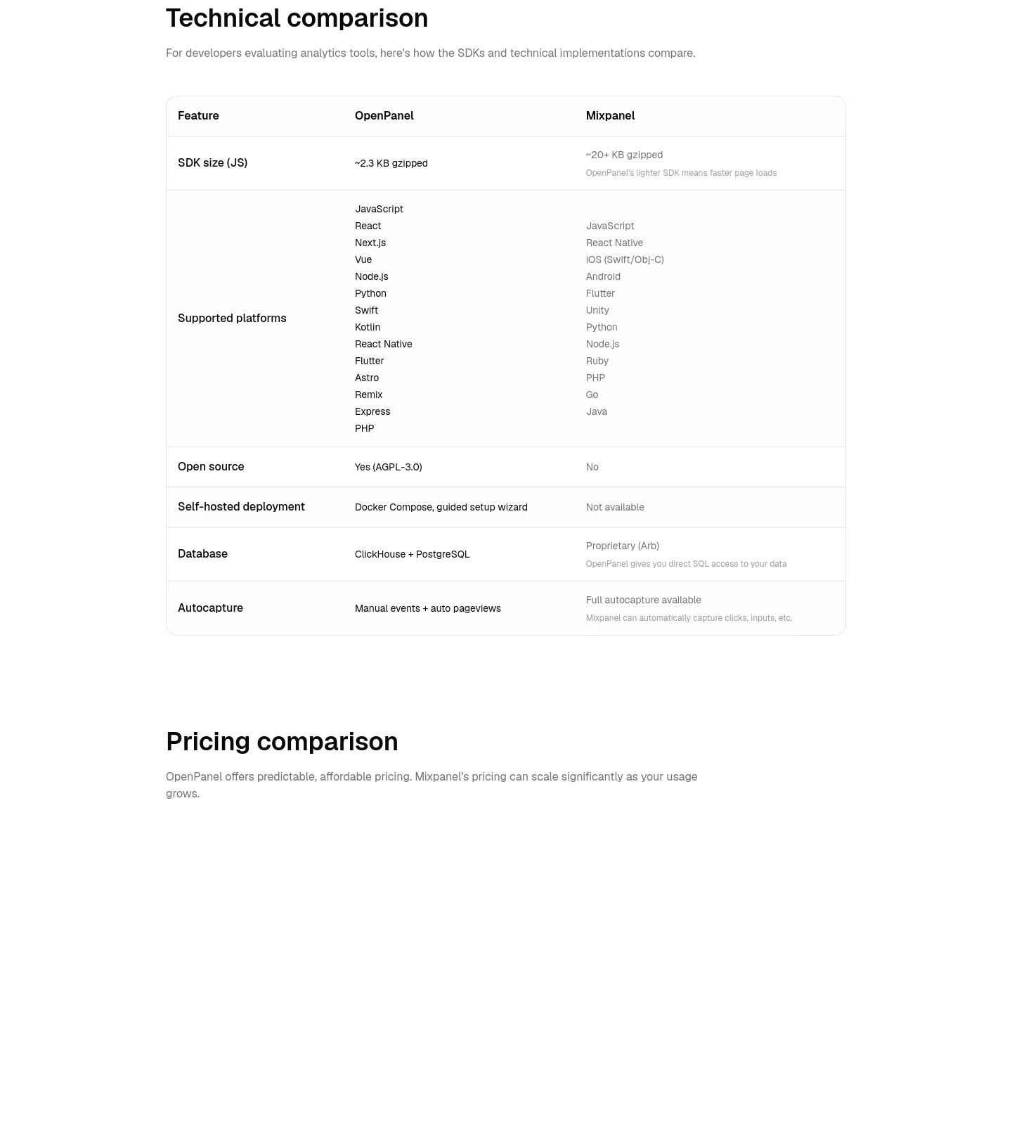
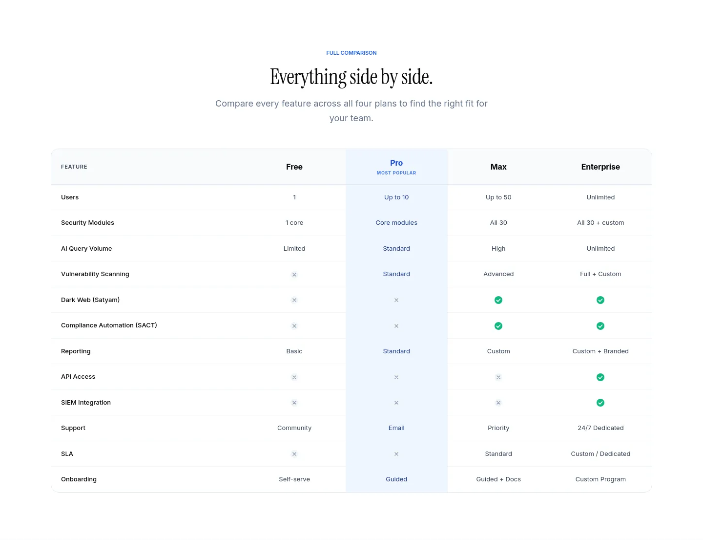
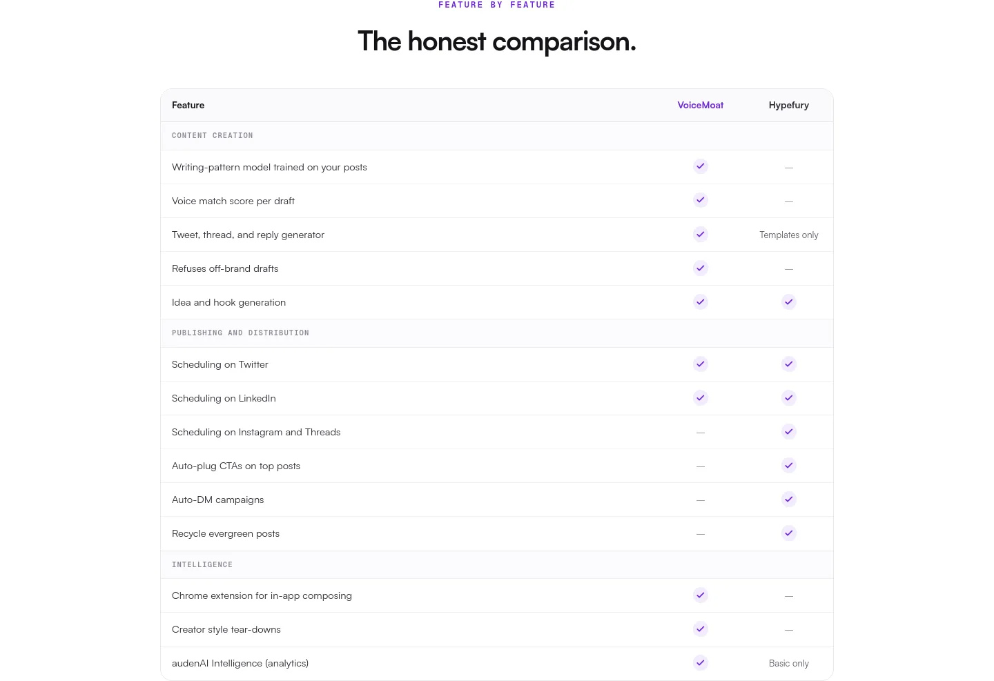
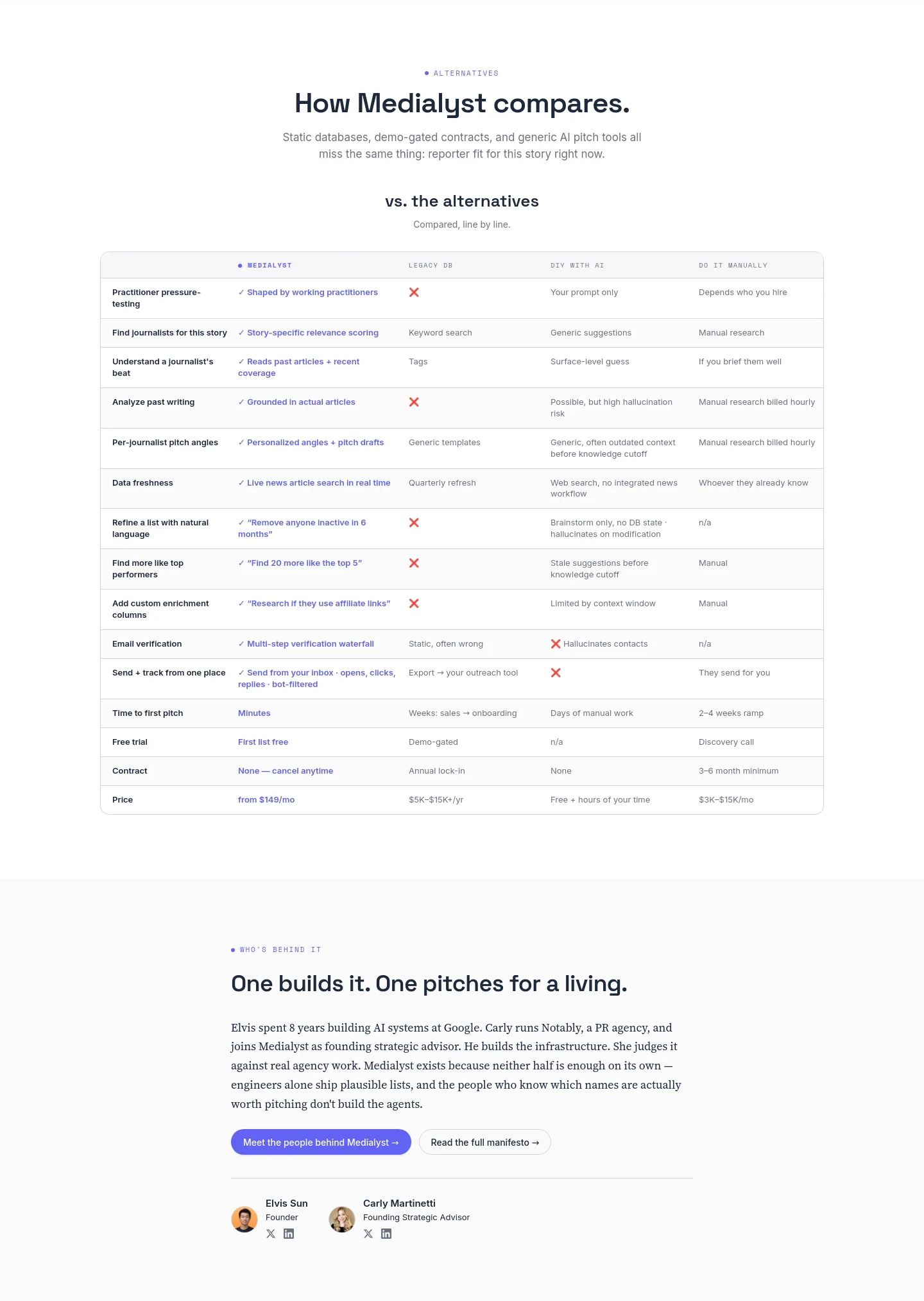
The open-tabs section. An honest grid with conceded rows: a table you win 10–0 reads as rigged. Each card is the actual comparison band, cropped from a crawled page's full-page screenshot at its measured position — the highest-scoring funnels first.
Comparison insights
- Typically 13.3% of the page tall across 178 sections
- Usually starts 40% of the way down across 178 sections
- Carries a median of 118 words across 148 sections
- Holds a median of 5 links across 49 sections
- Most often on a nav → hero → comparison → faq → footer page 38 of 178 pages
- comparison comes before faq 94% of the time 122 of 130 pages carrying both
Showing 24 of 178 sections


No sections match these filters.
How concentrated page shapes are, corpus-wide
36 distinct page shapes cover half of the 2474 pages we've measured; the top 10 cover 34%. The most common, nav → hero → content → footer, alone accounts for 297 of them (12%) — its content element is the classifier’s terminal fallback (a band nothing else matched), not a named section. Once the unnamed content fallback is removed from every sequence, 413 distinct shapes remain (down from 821 raw) and the top 10 cover 51% — the raw distinct counts move with detector coverage, not with design, so concentration is the number worth citing. Measured across the funnels we've walked: saas 83% · ecommerce 12% · affiliate 5% · lead gen 1%.
The pieces inside these: the Element Library. Back to all section designs.