SaaS pricing page examples
In the 1,022 SaaS pricing sections we measured, the typical pricing section runs 144 words (the middle half run 96 to 216) and takes up 13.3% of its page's height. 12% hold a comparison table (123 of 1,022).
What SaaS pricing sections look like, measured
Position. The typical pricing section takes up 13.3% of its page's height (the middle half run 9.2% to 21.3%) and begins 41.9% of the way down the page (the middle half run 12.4% to 63.4%). Both were measured on the same 1,022 SaaS pricing sections.
Contents. The typical pricing section holds 144 words (the middle half run 96 to 216), measured on 1,005, 3 links (the middle half run 2 to 4), measured on 660, 4 labelled links and buttons (the middle half run 3 to 6), measured on 869 and 18 images and inline SVG icons counted together (the middle half run 10 to 30), measured on 751.
Structure. Of the 887 SaaS pricing sections whose heading level was measured, 46 (5%) open with an h1 heading. Of the 1,022 SaaS pricing sections whose content was measured, 123 (12%) hold a real table element, the deterministic half of "laid out as a comparison", 74 (7%) capture input inline, with a field inside the section itself and 13 (1%) carry schema.org types that the publisher declared.
Among the SaaS pricing sections in the conversion-tactic cells, the share carrying each element was: price anchor in 39% (148 of 383); rating in 2% (7 of 394); guarantee in 6% (30 of 465); no credit card asked in 13% (44 of 342); scarcity in 1% (6 of 480); countdown in under 1% (1 of 490). A cell holding fewer than the published floor is left out, so an element that does not appear here was not measured often enough to state, not measured as absent.
Every figure above comes from the 1,022 measured SaaS pricing sections behind the table further down, and it moves when the corpus does. These are descriptions of what the pages we measured contain. They are not recommendations.
30 real SaaS pricing sections
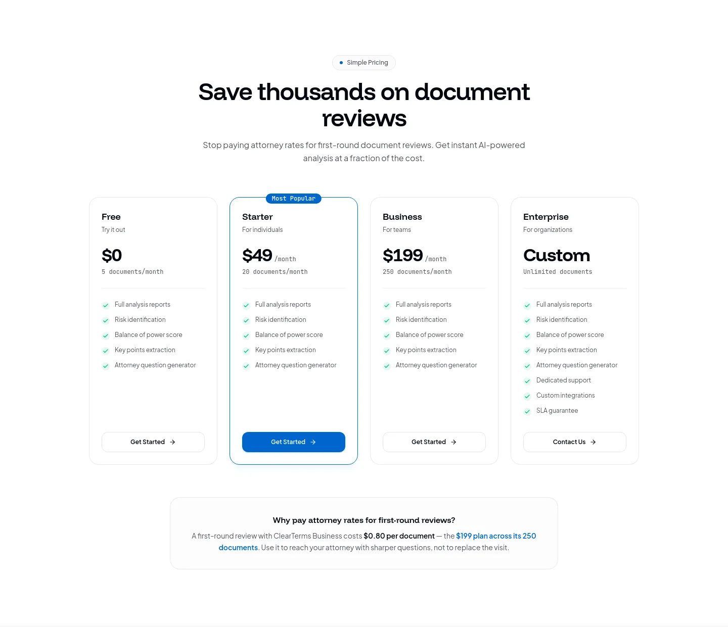
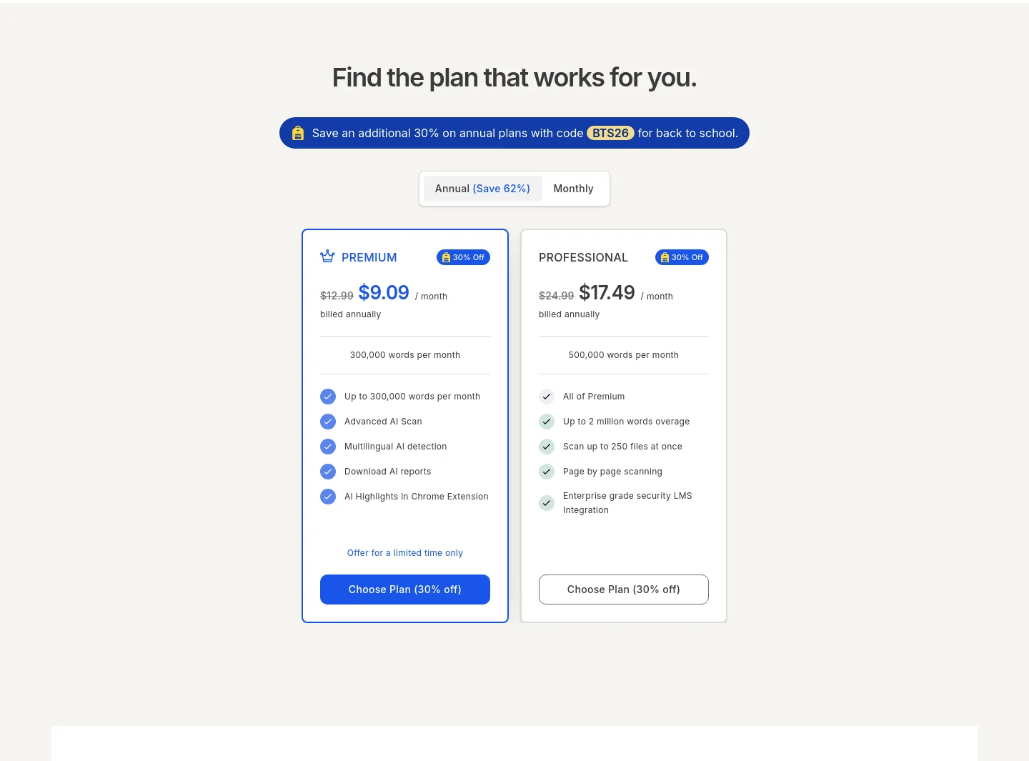
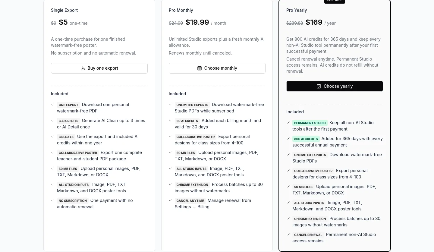
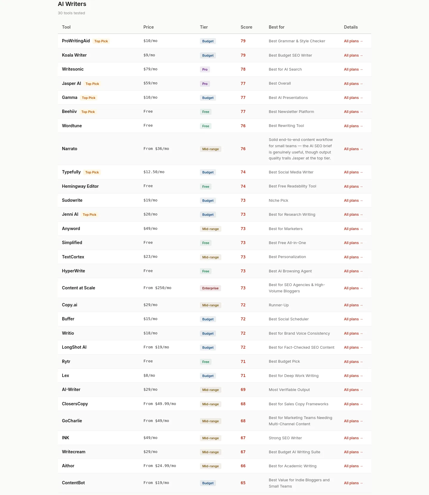
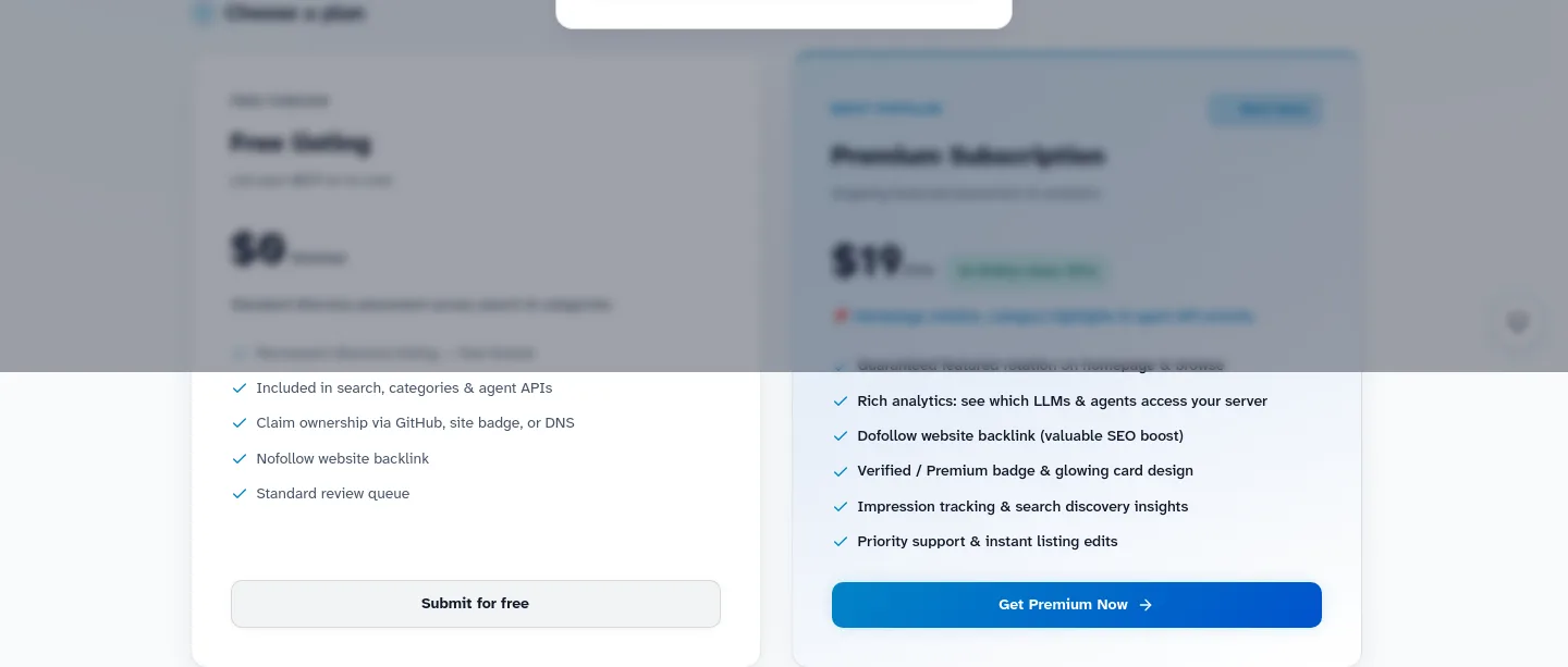
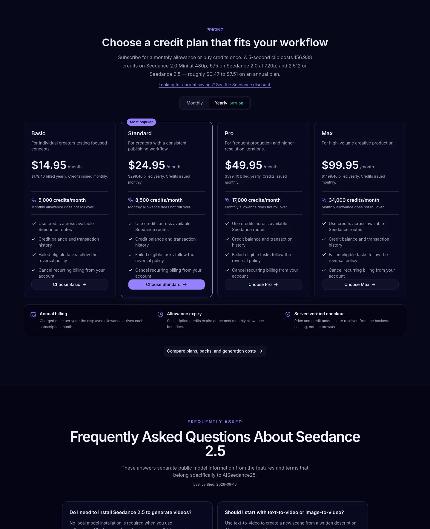
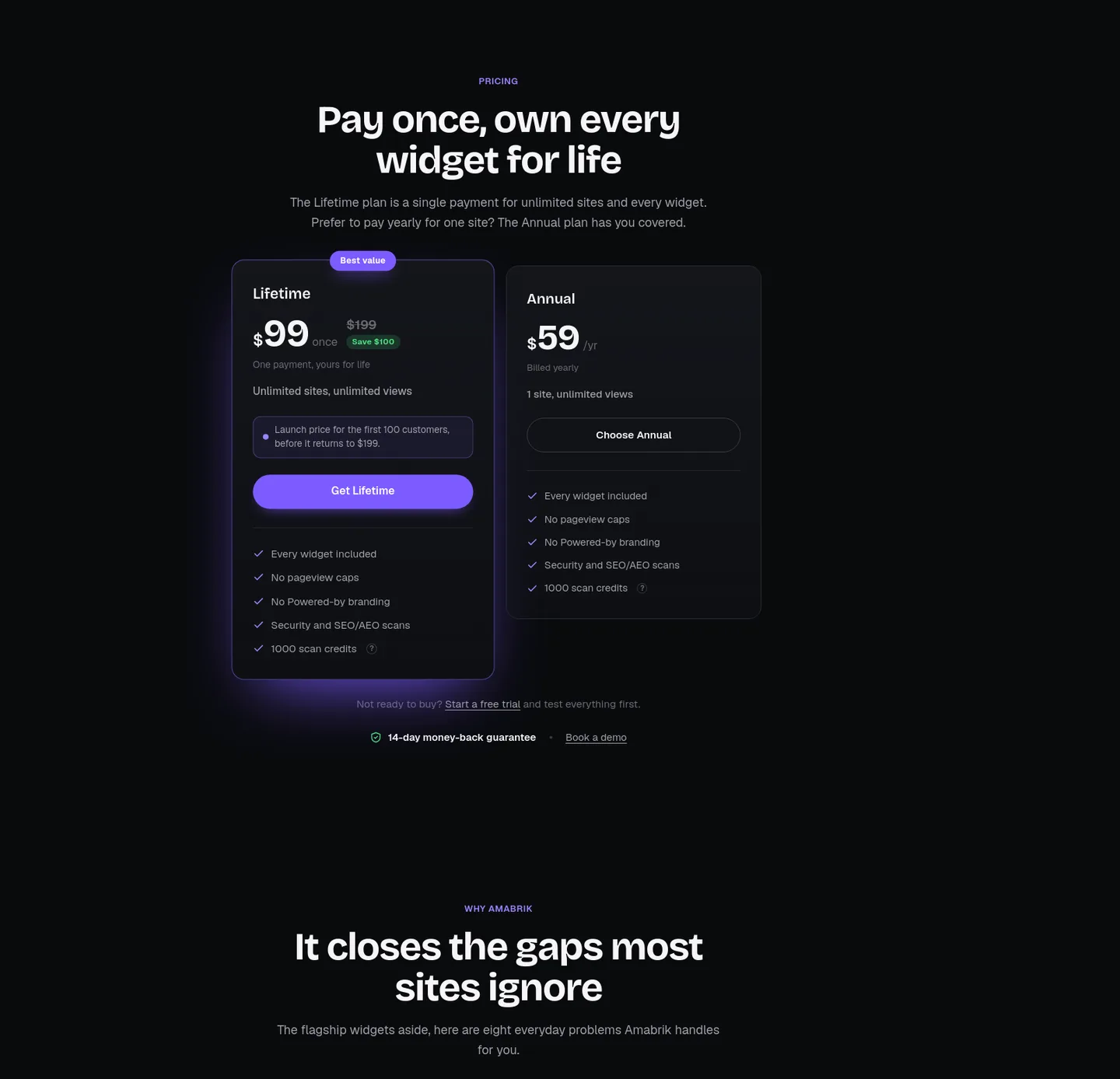
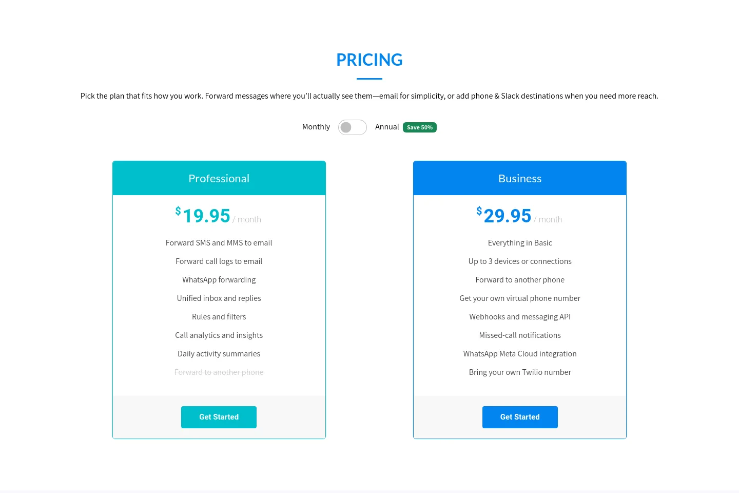
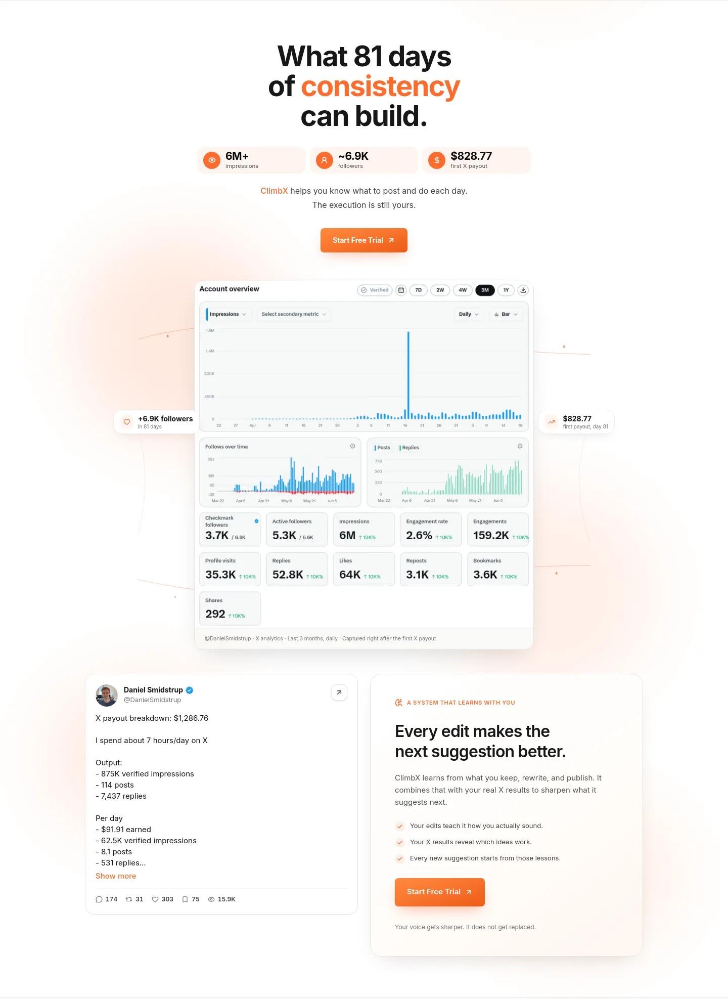
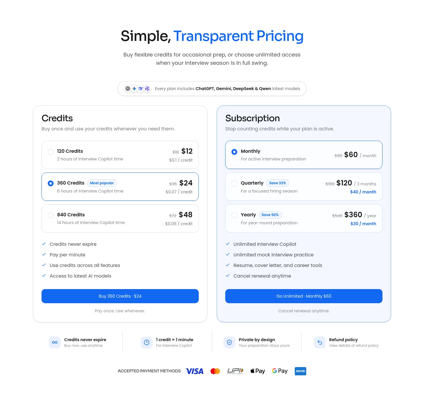
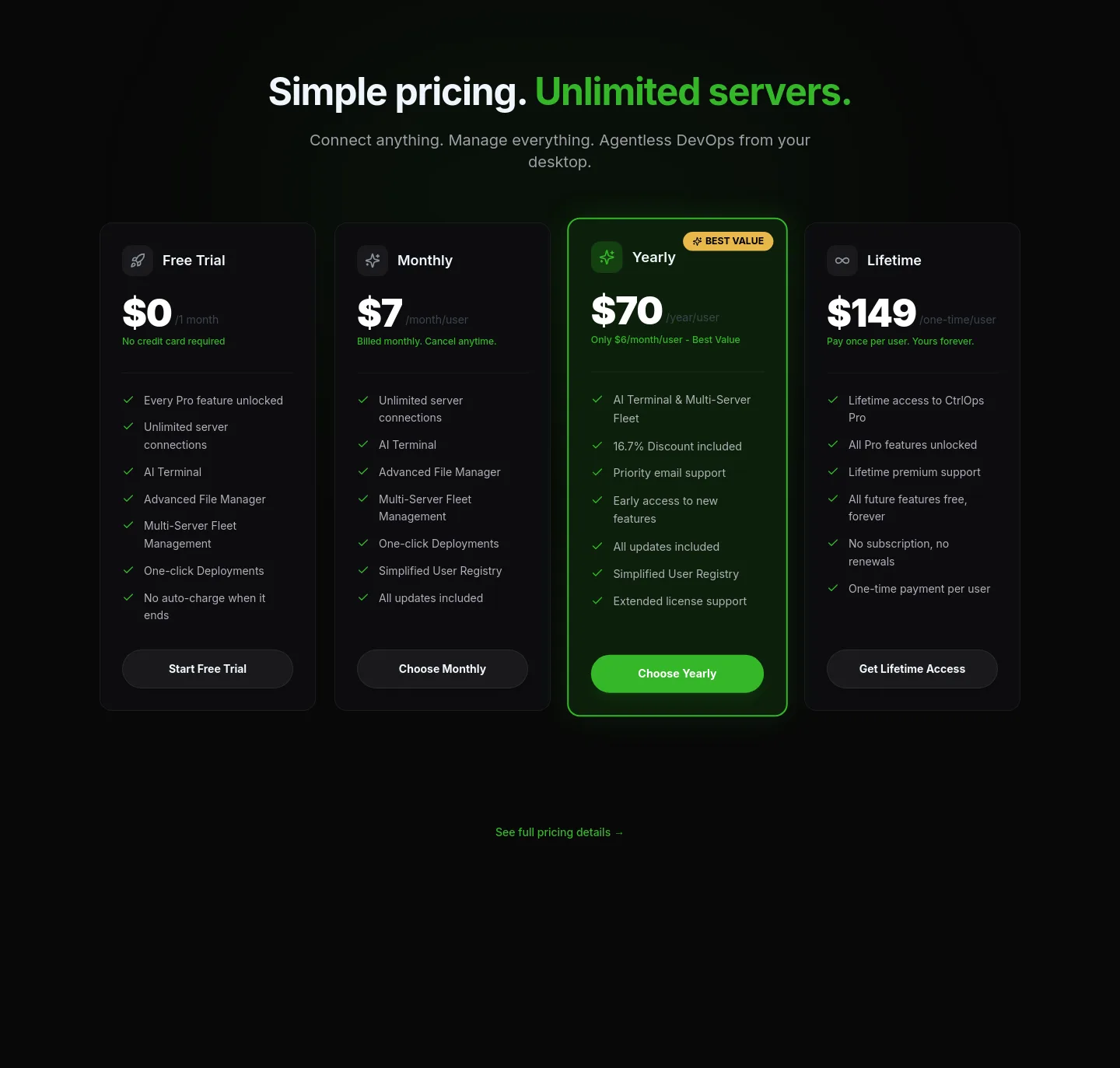
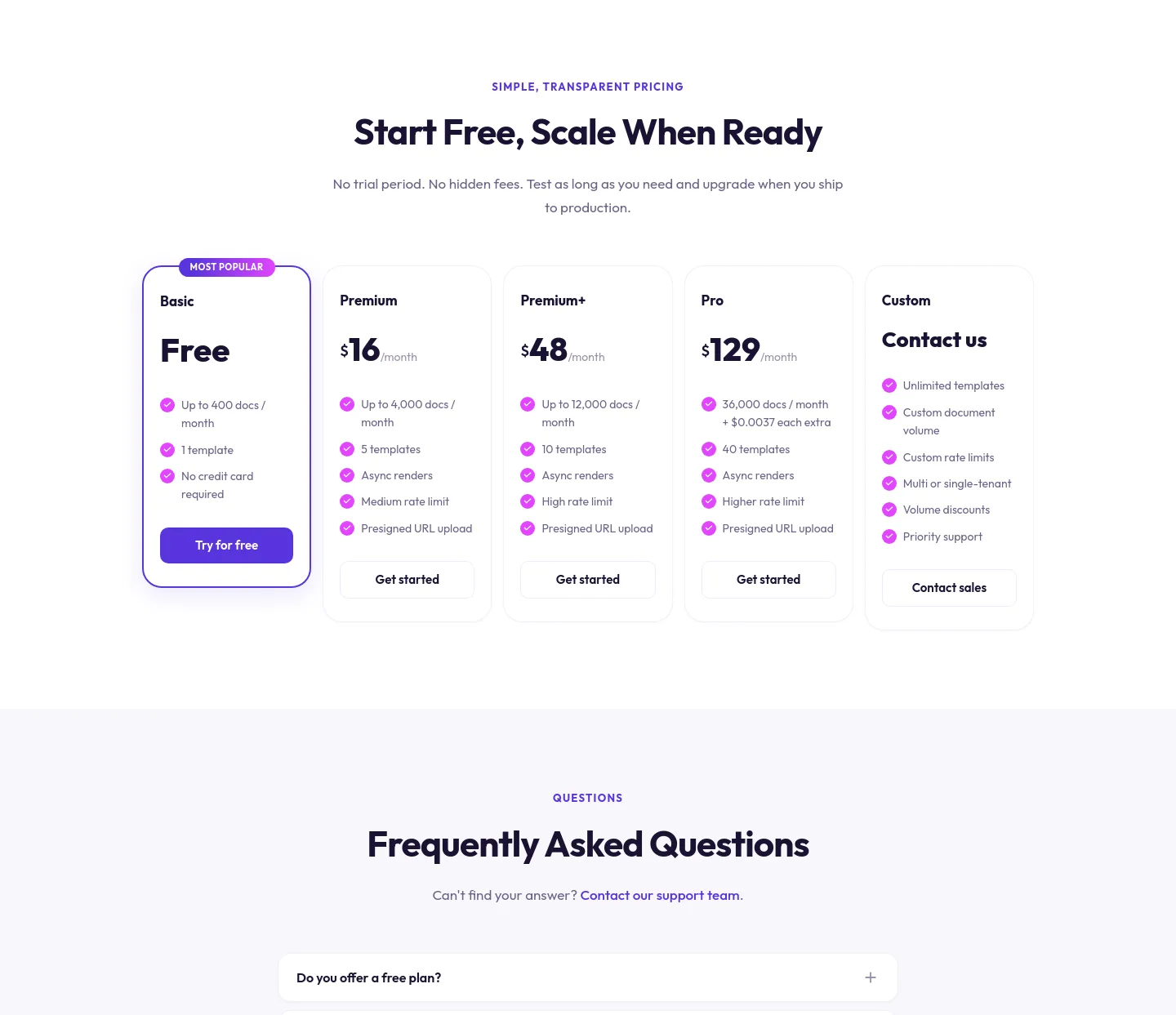
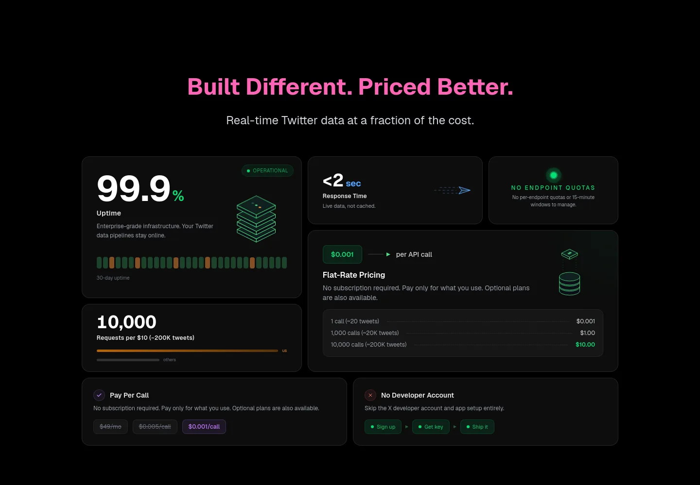
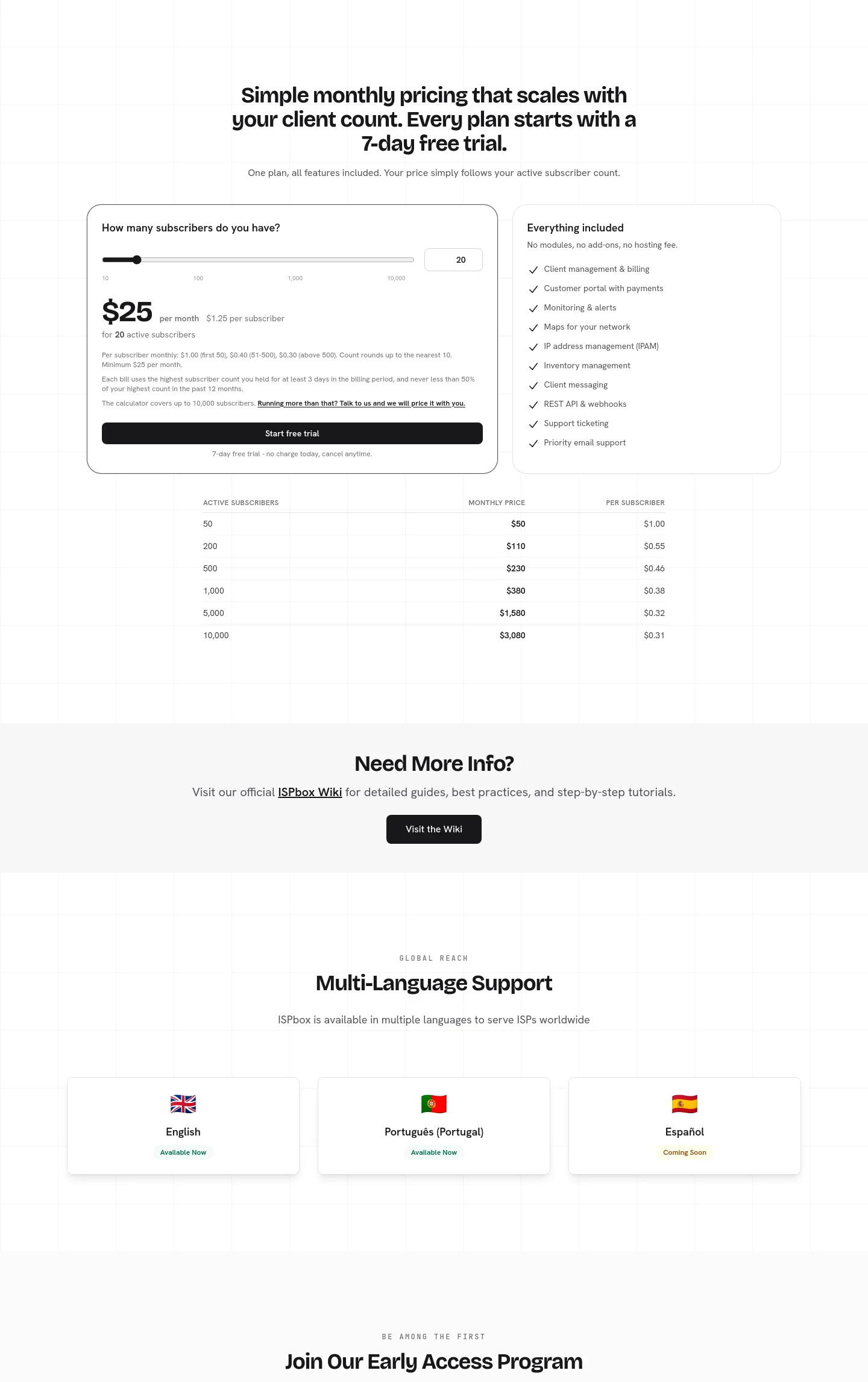
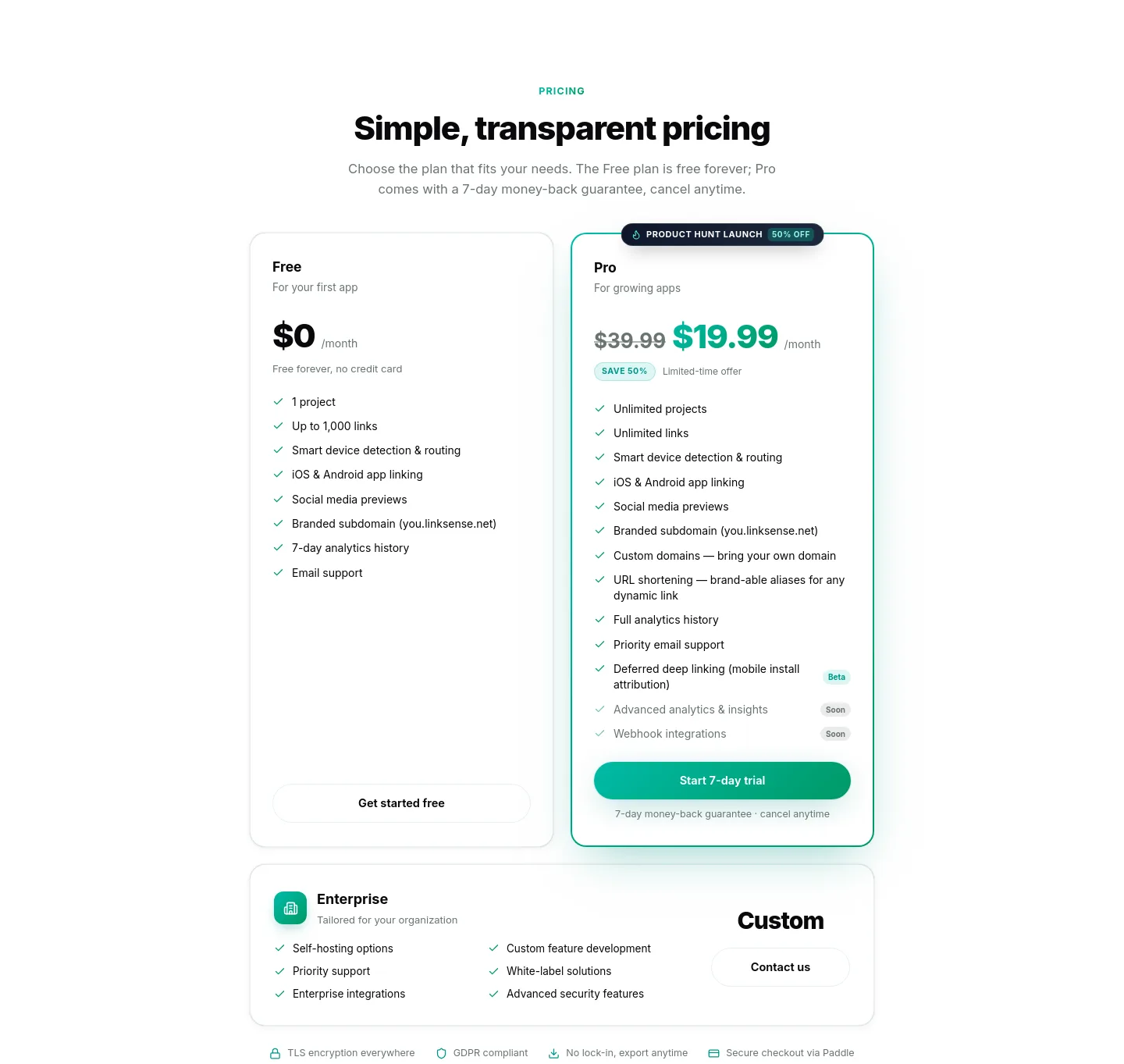
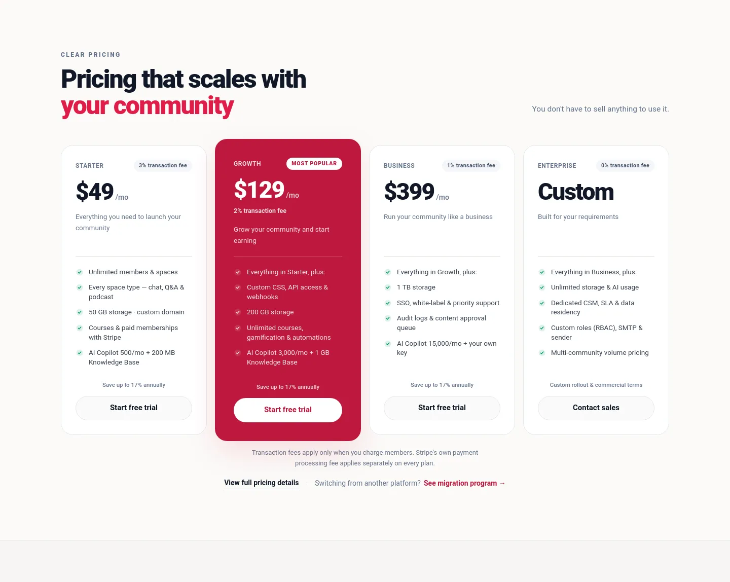
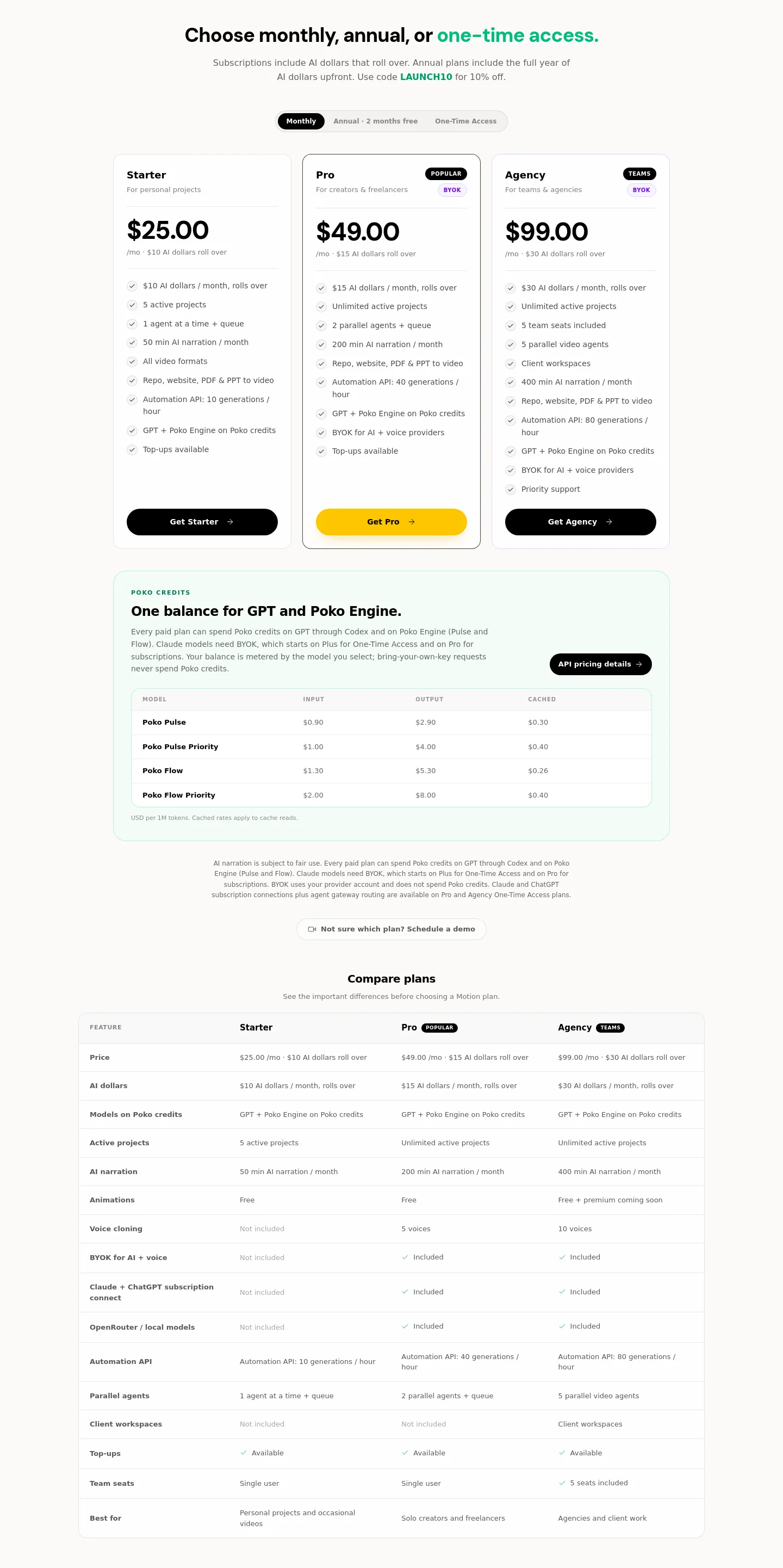
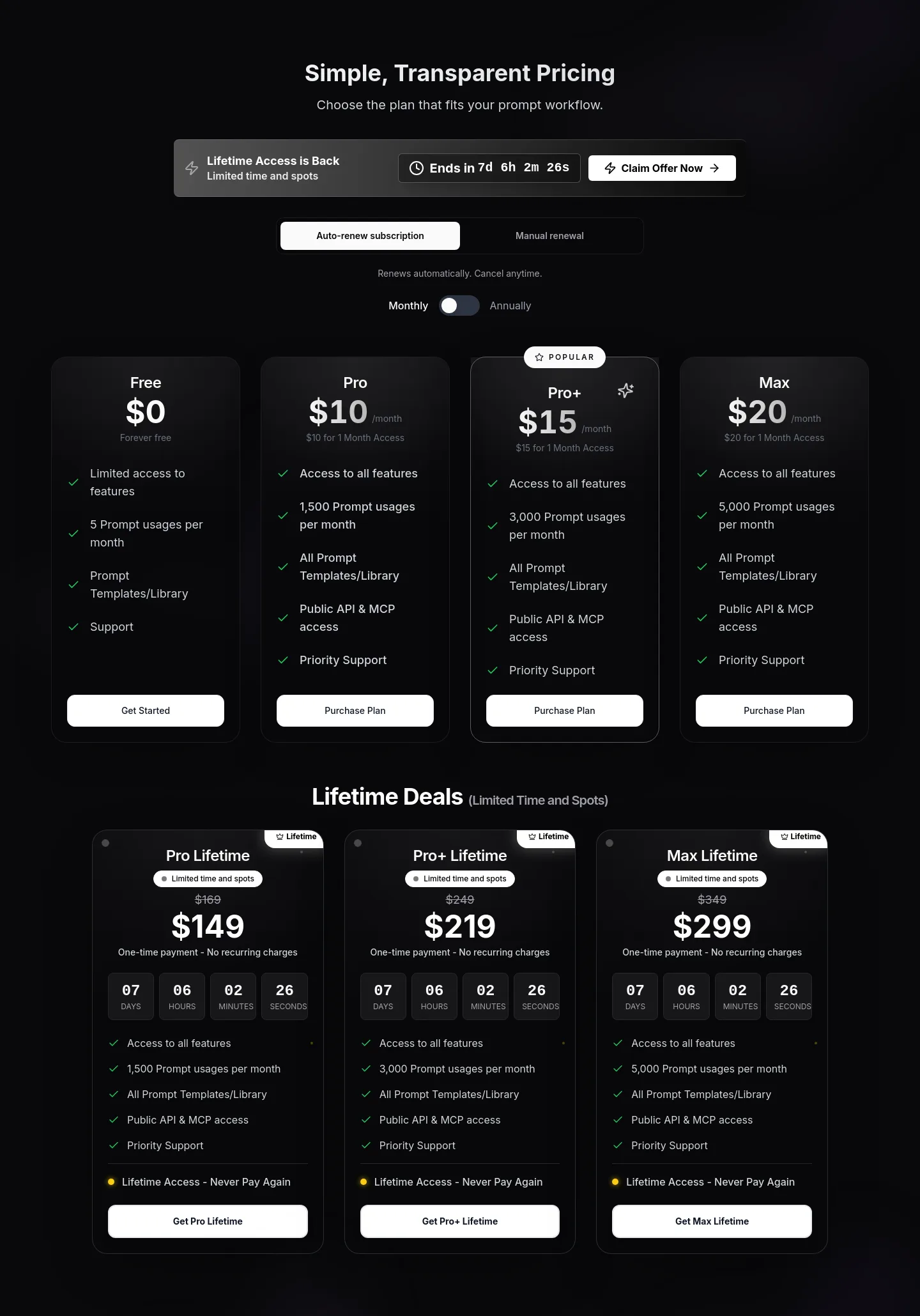
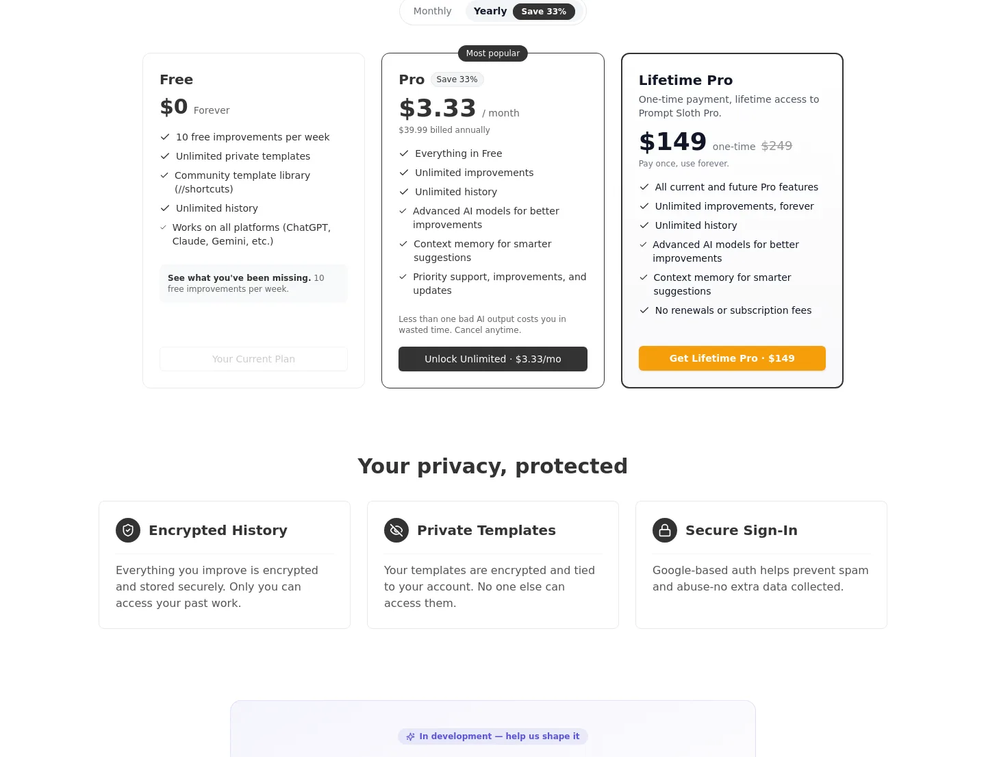
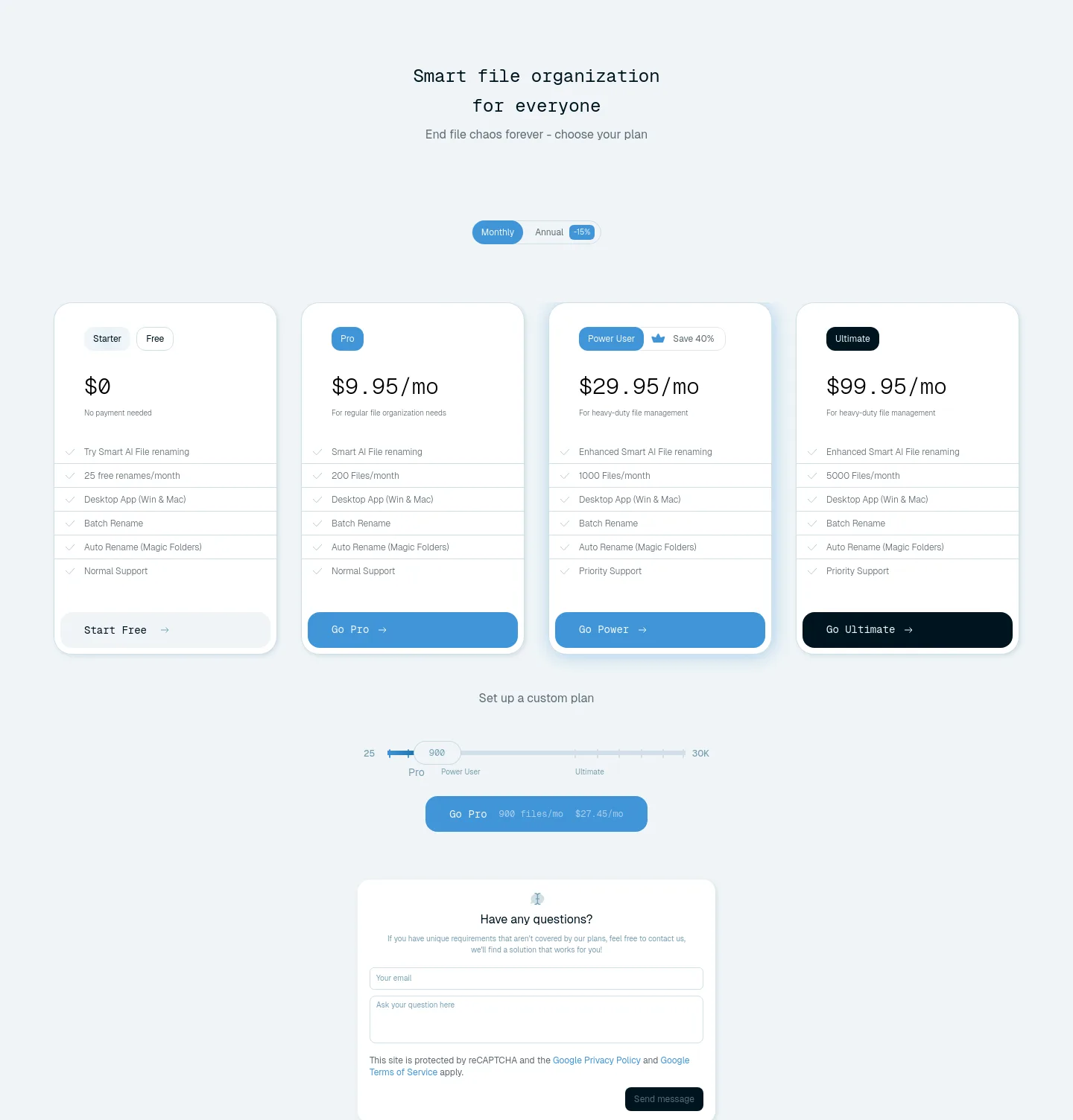
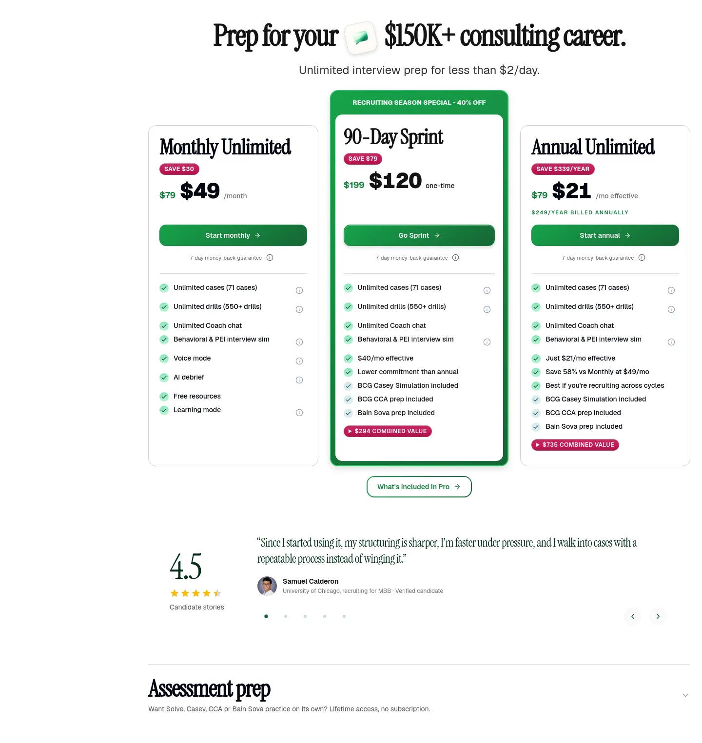
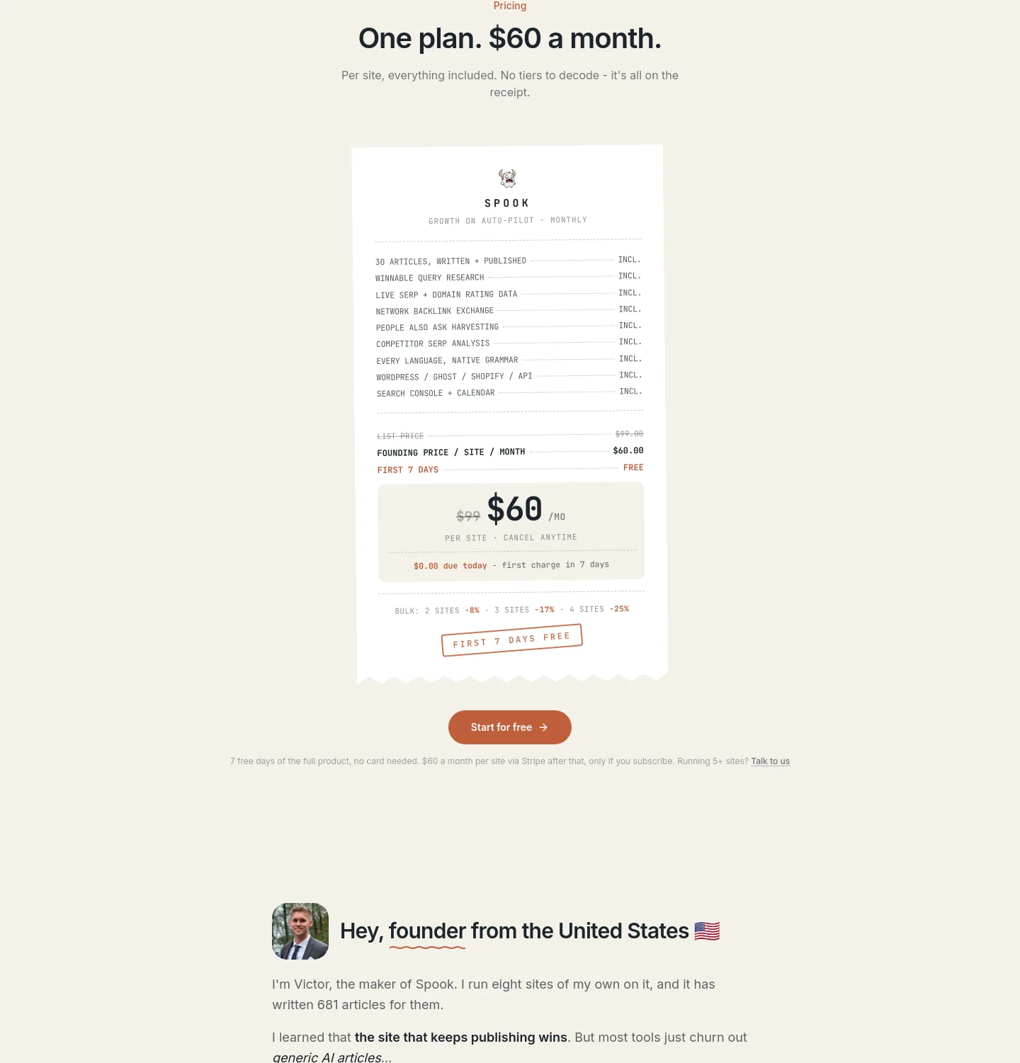
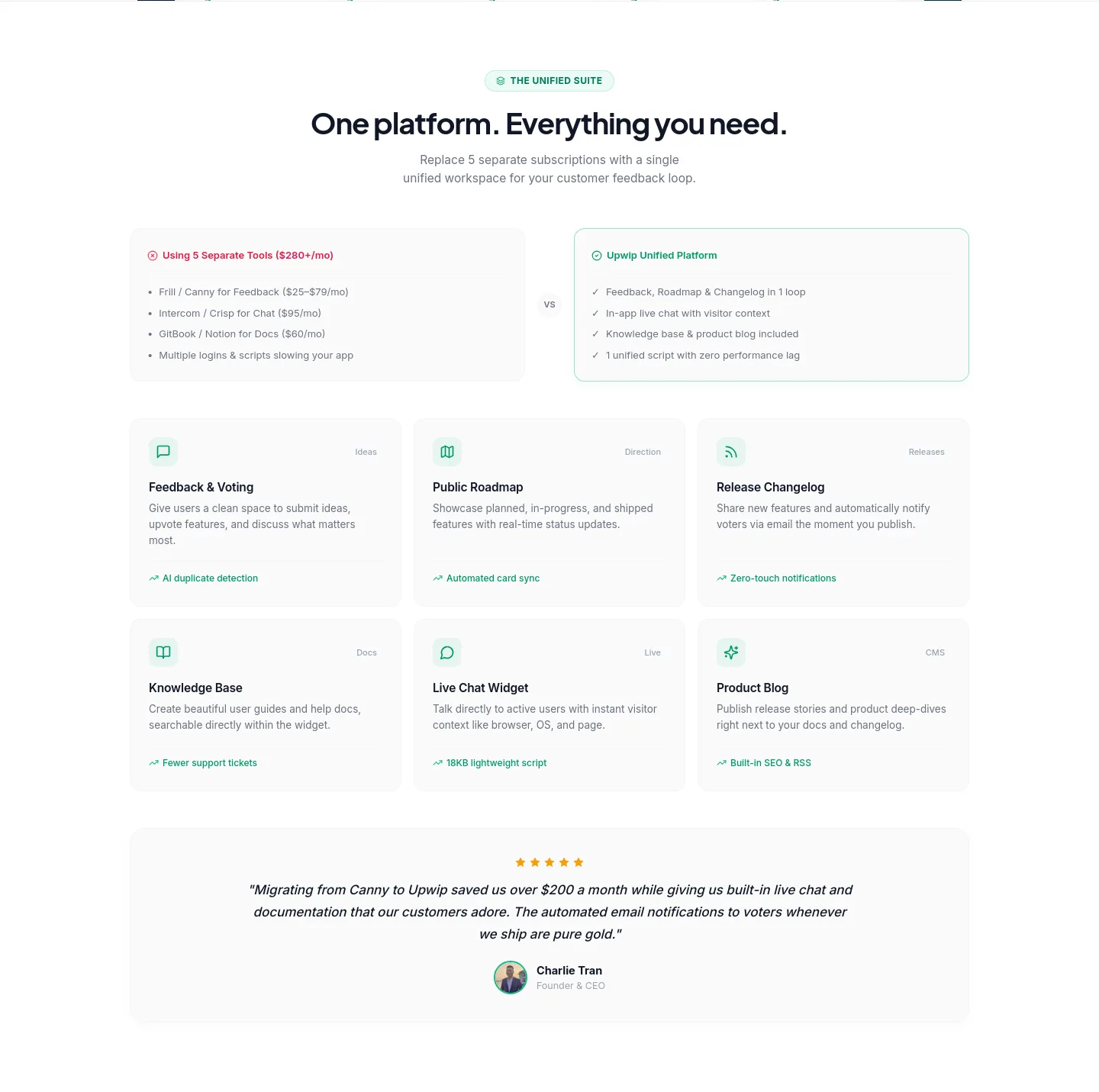
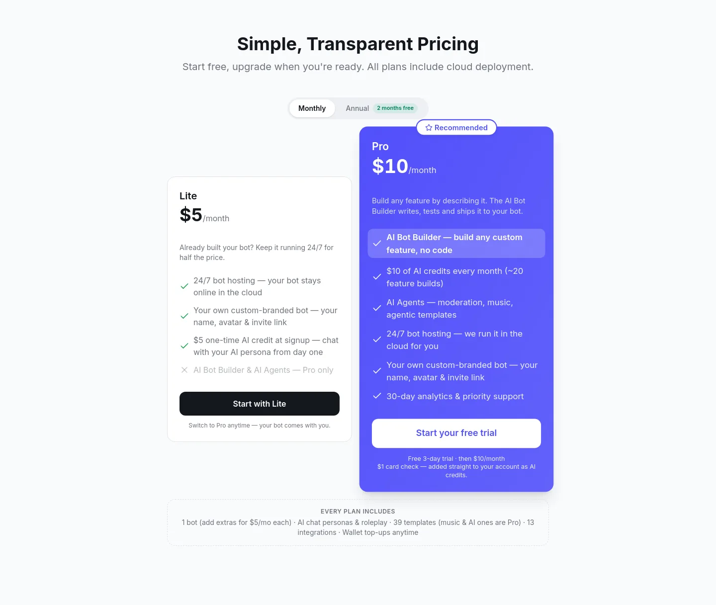
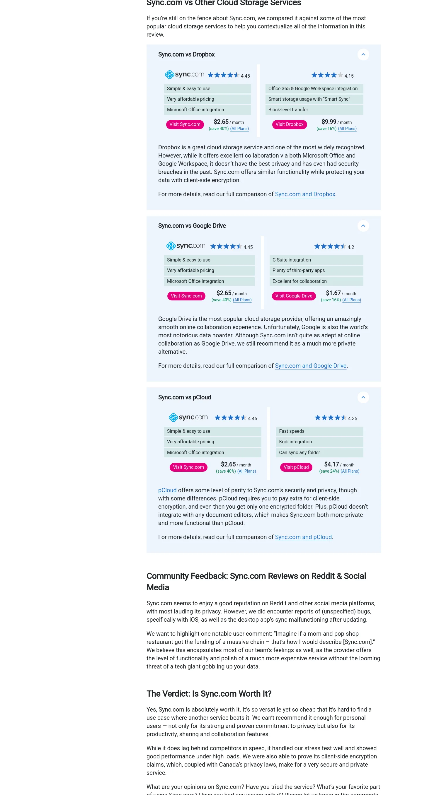
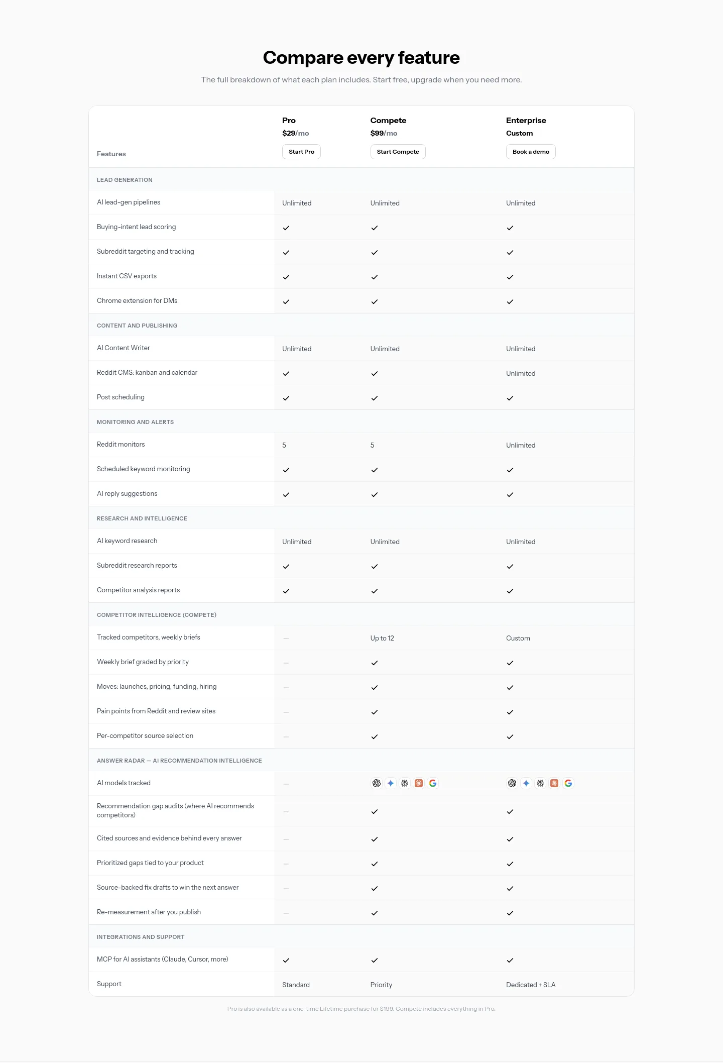
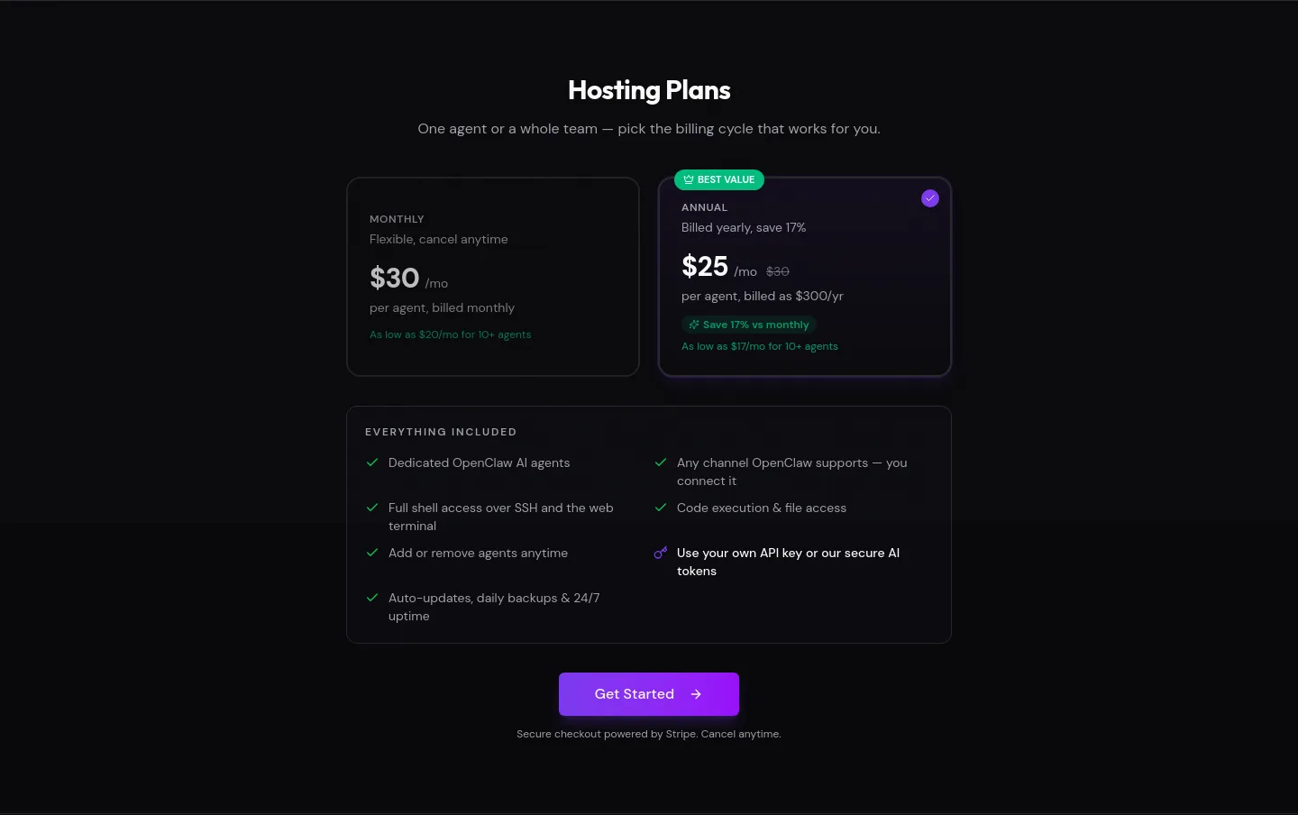
One example per site, in the same order as the full Pricing gallery, chosen from 781 SaaS sites that have a measured pricing section. Each card is the actual band, cropped from the site's full-page screenshot at its measured position; open one for the whole band and its measured contents.



How SaaS pricing sections vary
1,022 SaaS pricing sections measured.
| What we measured | Typical | Middle half | Measured on |
|---|---|---|---|
| Share of page height | 13.3% | 9.2% – 21.3% | 1,022 |
| Top edge | 41.9% | 12.4% – 63.4% | 1,022 |
| Words | 144 | 96 – 216 | 1,005 |
| Links | 3 | 2 – 4 | 660 |
| Links and buttons with a label | 4 | 3 – 6 | 869 |
| Images and inline SVGs | 18 | 10 – 30 | 751 |
| Opens with an h1 | 5% | 46 of 887 | 887 |
| Holds a comparison table | 12% | 123 of 1,022 | 1,022 |
| Captures input inline | 7% | 74 of 1,022 | 1,022 |
| Publisher declares schema.org types | 1% | 13 of 1,022 | 1,022 |
How common each element is
| Element | Present in | Of |
|---|---|---|
| Price anchor | 39% | 148 of 383 |
| Rating | 2% | 7 of 394 |
| Guarantee | 6% | 30 of 465 |
| No credit card asked | 13% | 44 of 342 |
| Scarcity | 1% | 6 of 480 |
| Countdown | under 1% | 1 of 490 |
The page around a pricing section
1,022 of the SaaS pricing sections were found on pages whose full section order was measured. The commonest order is nav → hero → pricing → faq → footer, on 234 of those 1,022 pages (23%). The 5 orders in the table cover 525 of 1,022 pages (51%); the other 497 pages follow orders too varied to list.
| Page shape | Pages | Share |
|---|---|---|
| nav → hero → pricing → faq → footer | 234 | 23% |
| nav → hero → pricing → footer | 132 | 13% |
| nav → pricing → footer | 62 | 6% |
| nav → hero → pricing → faq → cta band → footer | 49 | 5% |
| nav → hero → logo wall → pricing → faq → footer | 48 | 5% |
How we measured
Method and limits
Every number on this page was measured from the page's own DOM and computed styles, on captures dated 2026-08-03 to 2026-10-14. No AI judgment is involved: the same capture always gives the same figure.
N is the number of SaaS pricing sections measured, spread over 781 sites. Typical means the median, and the middle half is the 25th to the 75th percentile, so half of all measured pricing sections fall inside it. Each row states its own n, because geometry is measured on nearly every section while the content fields are measured on fewer.
Composition: SaaS accounts for 1,022 of the 1,150 pricing sections we measured across every industry (89%). The corpus is seeded from launch directories, so these are the ranges of the SaaS pages we measured, not of the whole web, and not a judgment of which are good.
This describes prevalence, not cause: how common a value is says nothing about whether it works. Nothing here is ranked, totalled or called better than anything else.
Keep going
- The measured reference for all pricing sections: the same figures for every industry, with the toggle.
- Every pricing section we have cropped, all industries, paginated.
- SaaS hero section examples: the same measurements for SaaS heroes.
- SaaS FAQ section examples: the same measurements for SaaS FAQs.
- All section designs and SaaS funnel examples.
Full reports for 8 of the sites shown: clearterms.co, gptzero.me, narrareach.com, techietribe.ai, blockposter.pro, writetested.com, allmcps.com, aiseedance25.app.
Back to the Pricing gallery or all section designs.