01
Homepage / Lander
6 tactics
$50 +3 more · 1 proof point
ecommerce · Sep 25, 2026
We found more conversion tactics here than on 25% of the 231 multi-step e-commerce funnels we have measured.
3 pages walked · measured by Roentgen 1.27.0
Every figure on this page was read off the live site by Roentgen 1.27.0 on 2026-09-25, a script that reads page structure, computed CSS and matched text. No AI judgment, nothing estimated, and a capture’s numbers stay as read.
Detection coverage, not a verdict. A low count means we did not detect those patterns, not that the funnel is weak.
chubbiesshorts.com shows 2 of the 15 tactics that apply to an ecommerce funnel, and we did not see the other 13.
Proven on the page · 2
review widget
FREE SHIPPING
Not seen on any step reached · 13
Absence is a measurement, not a recommendation: we do not know why a tactic is missing, whether it belongs here, or whether adding it would change anything. Where a walk stopped early, a tactic living deeper would also read as not detected.
We walked 3 pages. Products runs the most named tactics (7), and 2 pages tie for the fewest (6).
Their headline: “Account Hub”
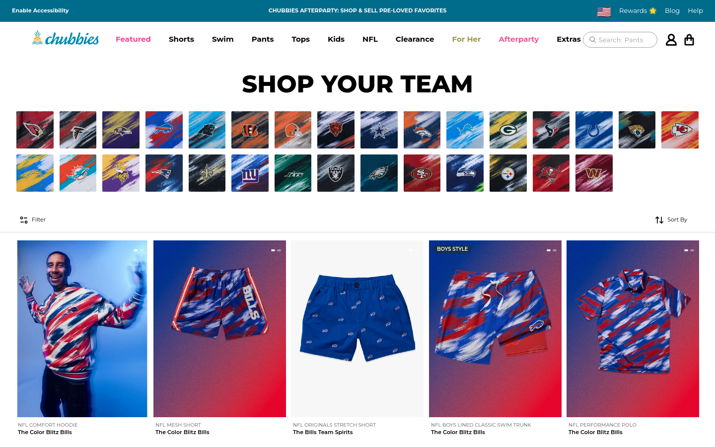
Their description: “The weekend has arrived. Get the good times fired up. Shop our raddest weekend-built gear, and get free shipping & free returns.”
Chubbies Shorts - Proper Length Men's Shorts & So Much More
The weekend has arrived. Get the good times fired up. Shop our raddest weekend-built gear, and get free shipping & free returns.
Account Hub
🇺🇸
Search: Shorts Swim NFL Pants Golf Kids
FEATURED
SHORTS
SWIM
PANTS
TOPS
KIDS
EXTRAS
Join or Sign In+2 more, not shown
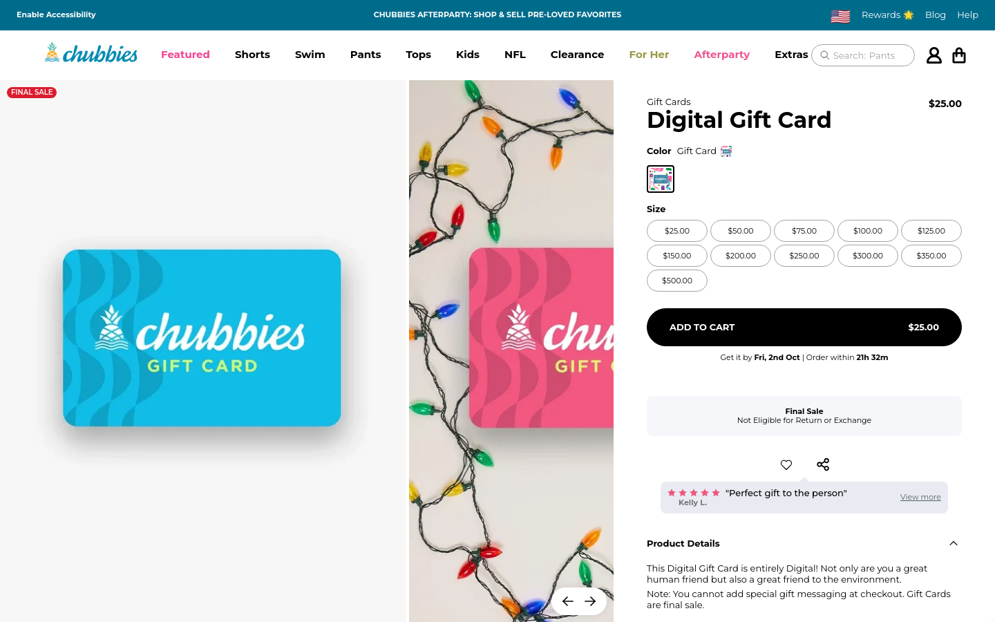
$50
$50.00
$100
$0.00
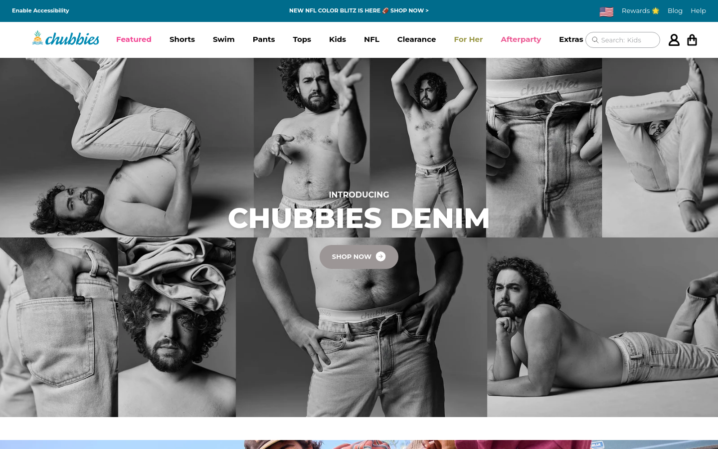
structural bands identified on this funnel, cropped from its own capture

84% of measurable text passes WCAG AA. 4+ runs fail. 33% of text was unmeasurable (over images/gradients). not counted either way.
worst: “Introducing” at 1:1 (16px, #ffffff on #ffffff). needs 4.5:1
Raise text/background contrast to ≥4.5:1 (≥3:1 for large text), especially on CTAs and body copy.
What this measuresSmallest sampled text is 10px, below the 13px floor this check uses.
Keep body copy ≥15-16px; reserve sub-13px for fine print only.
What this measuresBody line-height is 1×, tight enough to hurt readability.
Set body line-height to ~1.4-1.6×.
What this measures3 of 7 form fields have no label.
Give every input a <label> or aria-label; placeholders are not labels.
What this measures198 buttons/links have no accessible name (icon-only, no aria-label).
Add aria-label to icon-only buttons and links.
What this measuresAt least 11.5 MB across 302 measurable resources. 406 cross-origin resources did not expose a size, so the real total is higher.
Compress and lazy-load below-the-fold media; drop unused third-party scripts.
What this measures32 stylesheets/scripts in <head> block first paint.
Defer non-critical JS (defer/async) and inline only critical CSS.
What this measures232 images are shipped at more than 2x the width shown.
“Screenshot_2023-03-22_at_3.09.43_PM.png?” is 876px wide, displayed at 32px
Serve responsive sizes (srcset/sizes) matching the rendered width.
What this measures625 of 784 interactive targets are under 44×44px on mobile.
smallest: “Account” at 20×24px
Give tappable controls a ≥44×44px hit area. the touch minimum.
What this measures10 paragraphs run past ~95 characters per line.
Cap measure at ~60-75ch for comfortable reading.
What this measures3 links use generic text (“click here” / “learn more”).
Make link text describe its destination out of context.
What this measuresThe landing page has no <h1>.
Use exactly one <h1> as the page’s title.
What this measures2 headings skip a level (e.g. <h2> followed by <h4>). Screen-reader users navigate by this outline.
Step heading levels one at a time; use CSS for size, not a deeper level.
What this measuresNo same-page “skip to content” link was found. Keyboard users tab through the whole nav on every page.
Add a first-in-DOM <a href="#main"> that is visible on focus.
What this measures2 controls have an aria-label that does not contain its visible text, so voice-control users cannot activate it by saying what they see.
Make the accessible name start with the visible label text.
What this measuresNo <main> landmark. screen-reader users cannot jump between regions.
Wrap the page in <header>, <main> and <footer> (or matching ARIA roles).
What this measures55 elements look clickable but cannot be reached by keyboard.
“Spend $100. Get a Free Gift. Choos”, “Size”, “Size”
Use <button>/<a>, or add role + tabindex="0" and a key handler.
What this measuresNo autocomplete attributes across 6 fields. browsers cannot autofill.
Add autocomplete="email"/"tel"/"name" to identity fields.
What this measuresMobile viewport · Language declared · Image alt text · Inline validation
Their primary colour is #ee5780, on a #ffffff background with text in #ffffff.
Body copy in their text role, on a surface card.
We also ran these layers on the pages we captured and found nothing to show: Elements, Playbook match (2 of 9 layers). That is a measurement of this funnel, not a recommendation, and a layer we never ran is not listed.
Measured ranges for the parts of a page, from the funnels we have x-rayed.
Navigation barsCTA sectionsFeature gridsEmail capture sectionsFootersWhy we walk the whole funnel
The same measurements, in formats a build agent can read.